
MUP
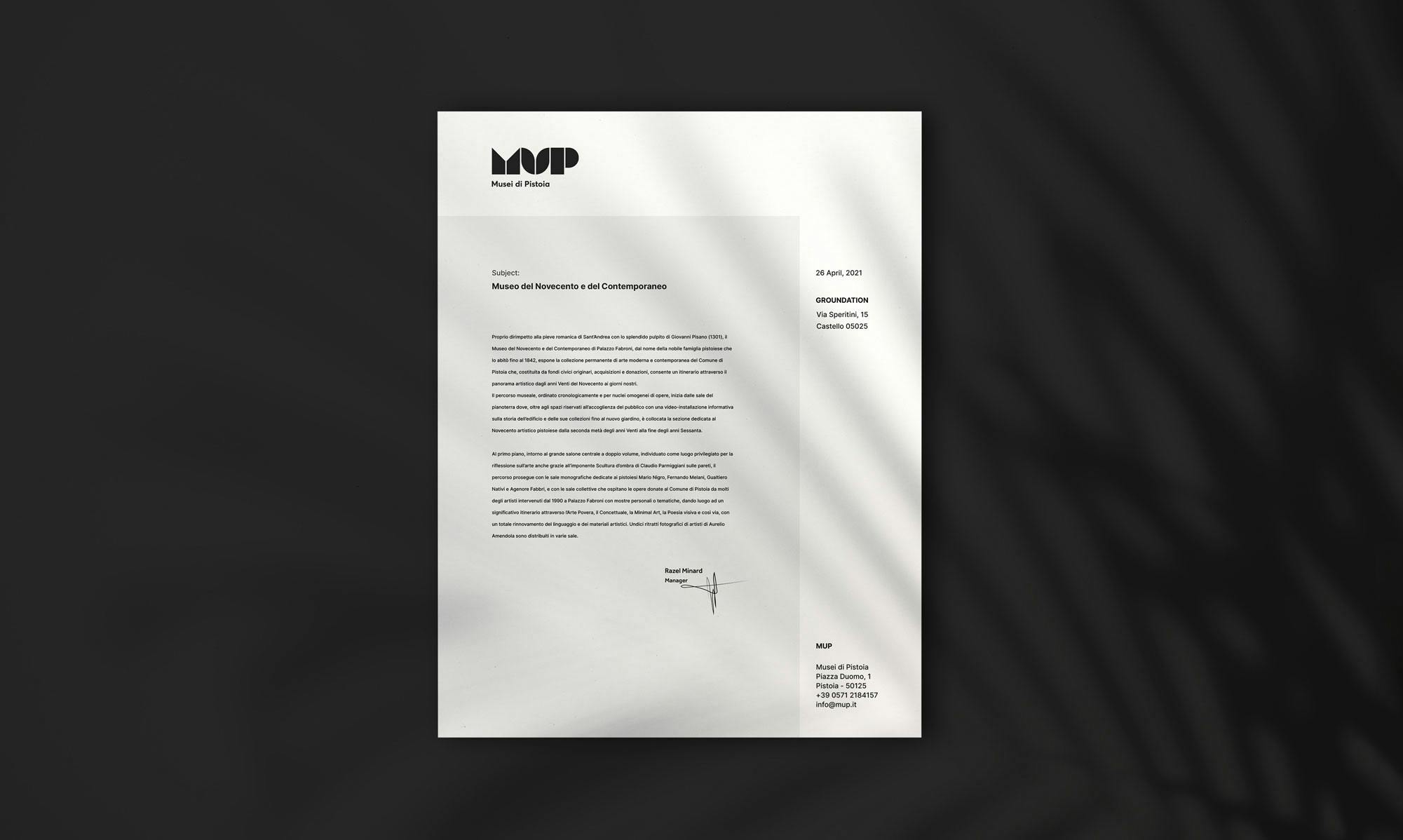
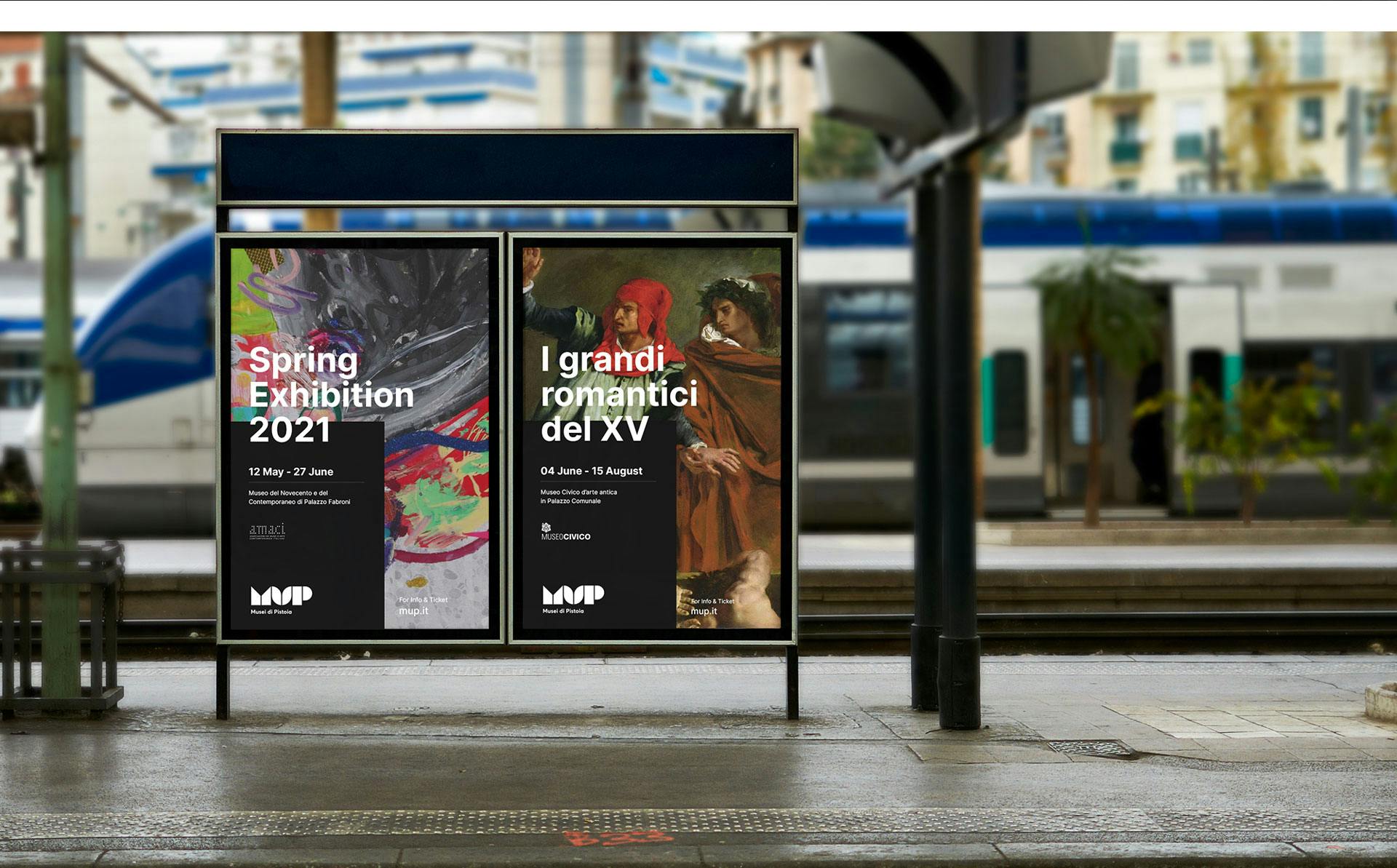
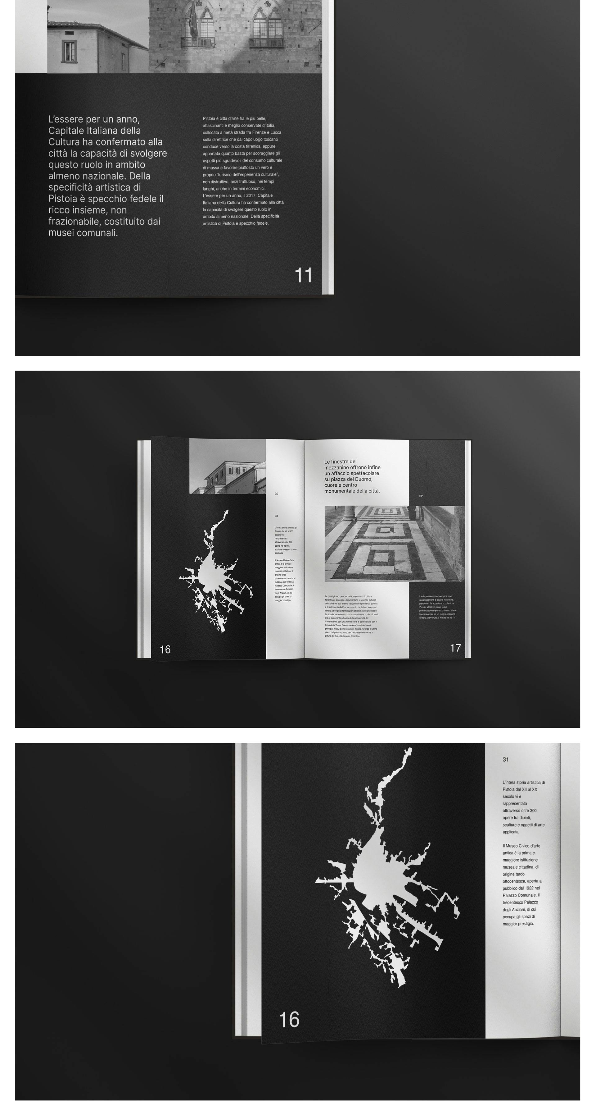
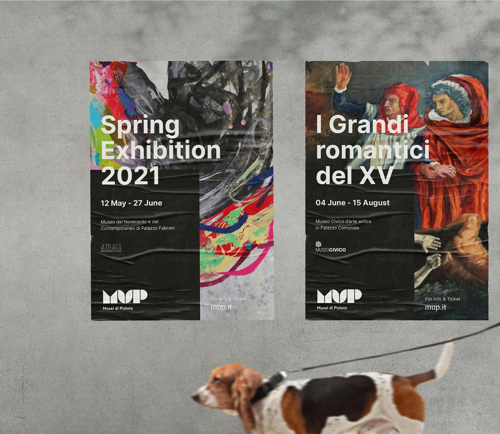
MUP brings together the most important museums in the city of Pistoia and is meant to be a bridge connecting the public with Pistoia's cultural organizations. The project was submitted to the contest for the creation of the new brand.


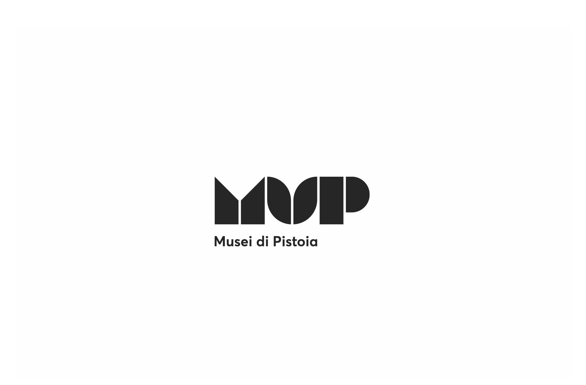
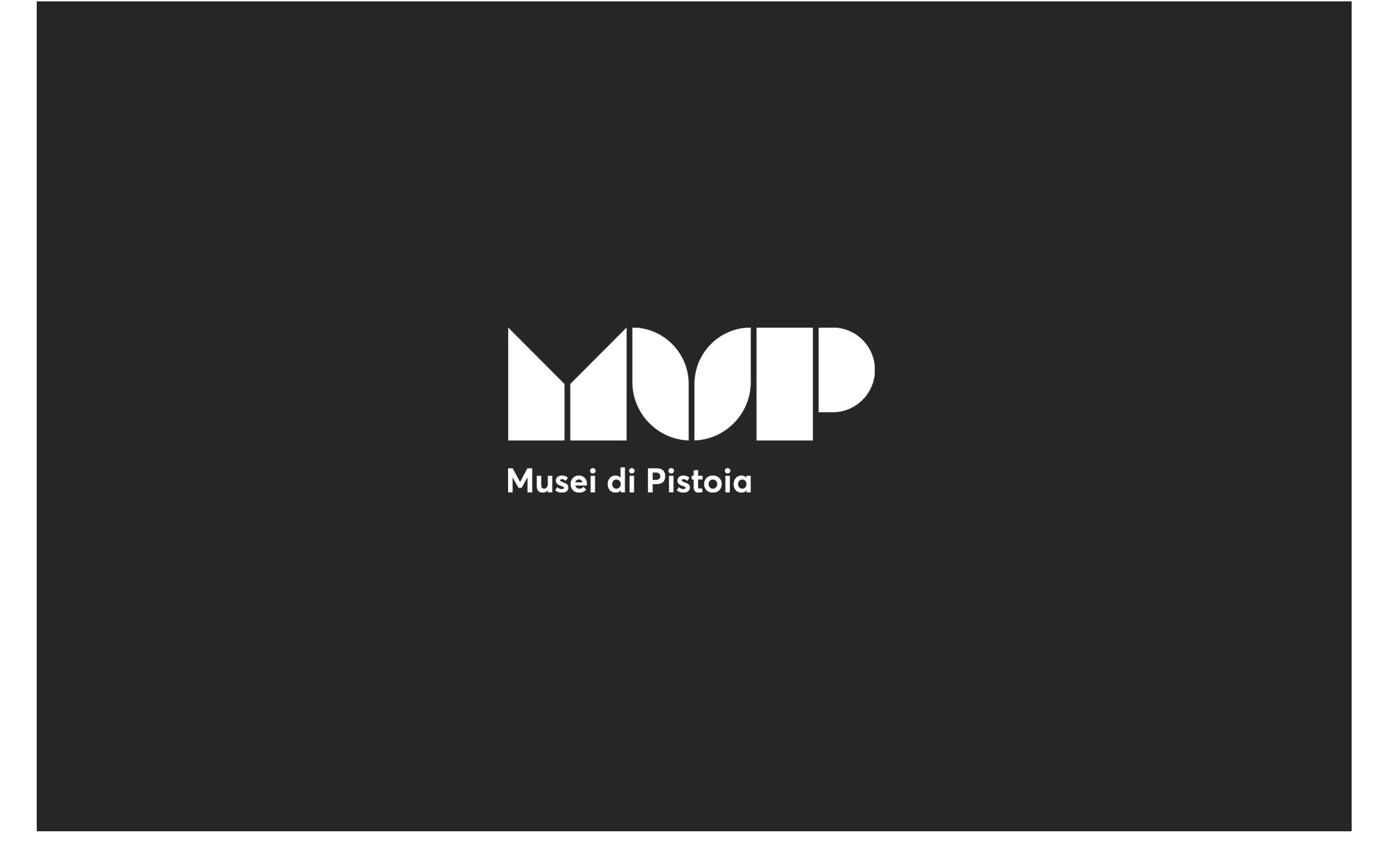
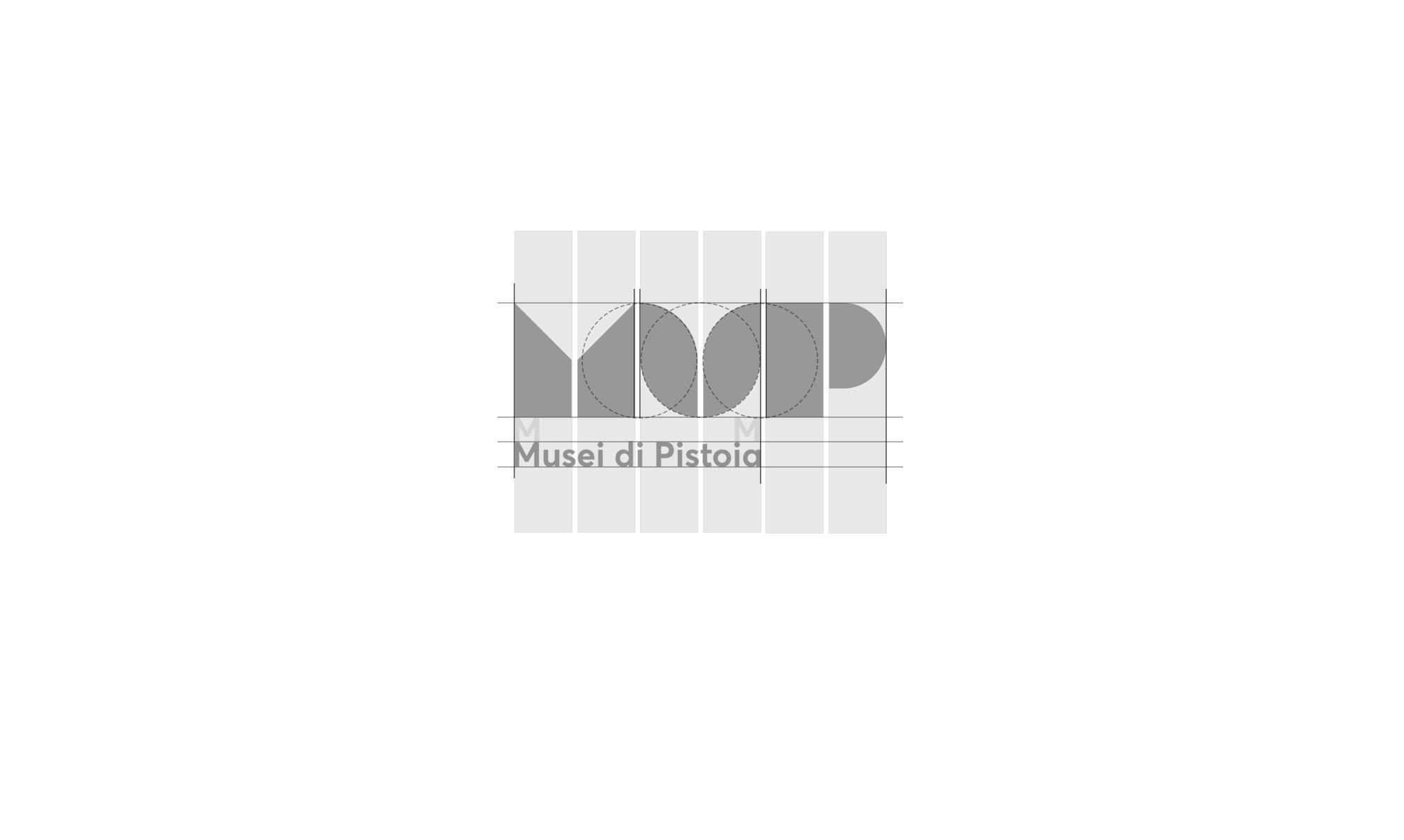
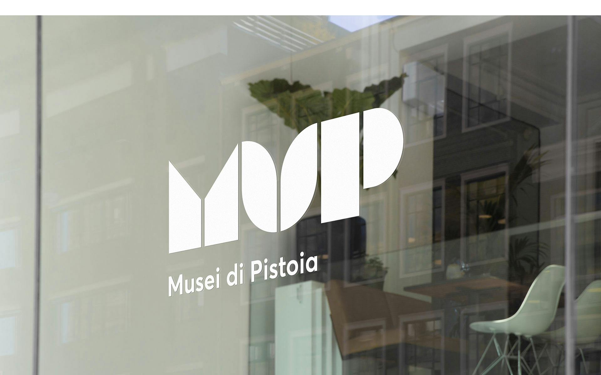
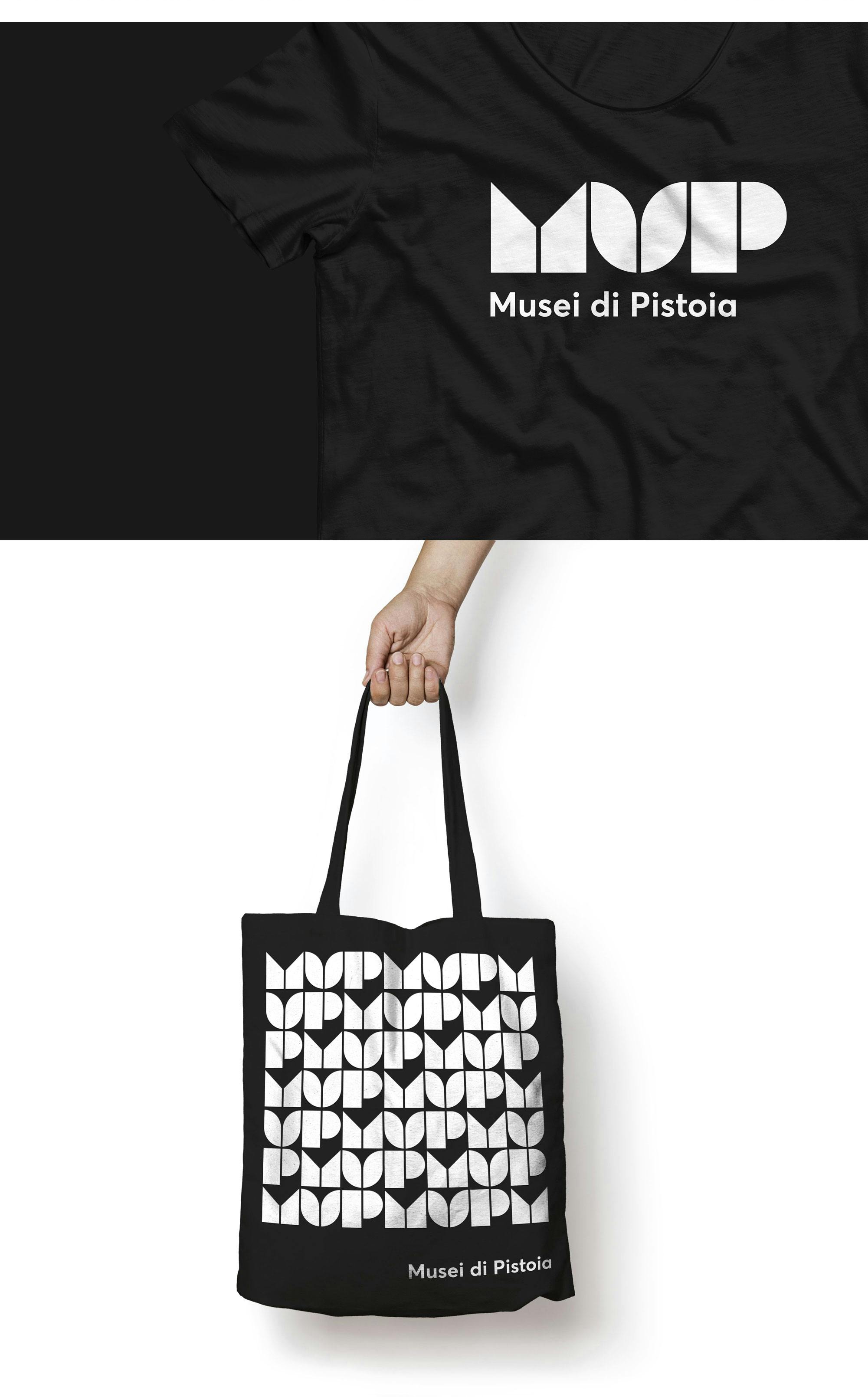
The brand represents the Pistoia museum system, expressing that complex concept visually through simple geometric shapes.
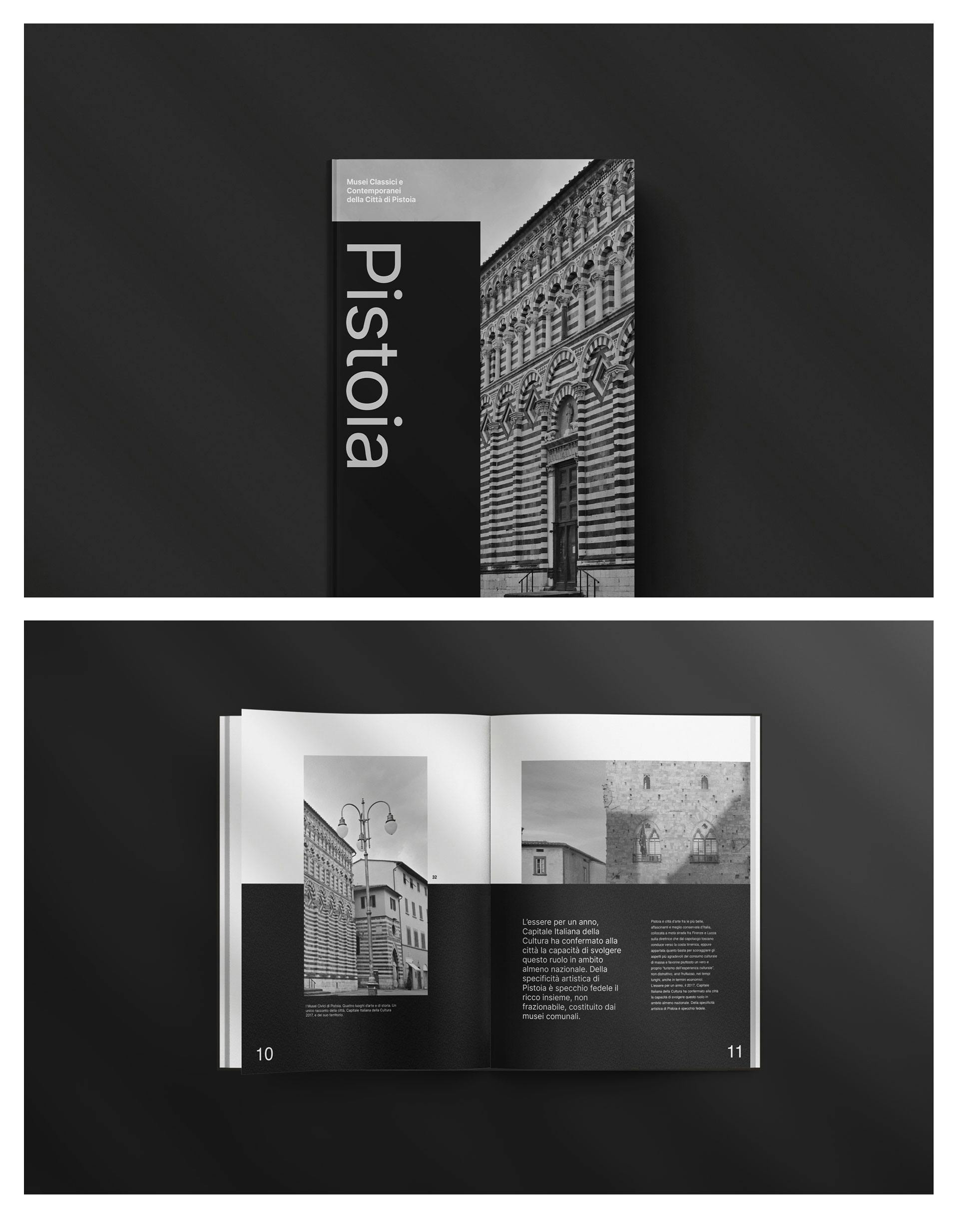
The negative spaces between the shapes play a key role, not only in reinforcing this first concept but also in recalling the two-tone striping typical of Tuscan, and especially Pistoian, Romanesque architecture, which can be seen on most of the museum system's buildings. The individual shapes, simple yet bold and striking, represent the individual venues involved, which together give life to MUP, the museum system.
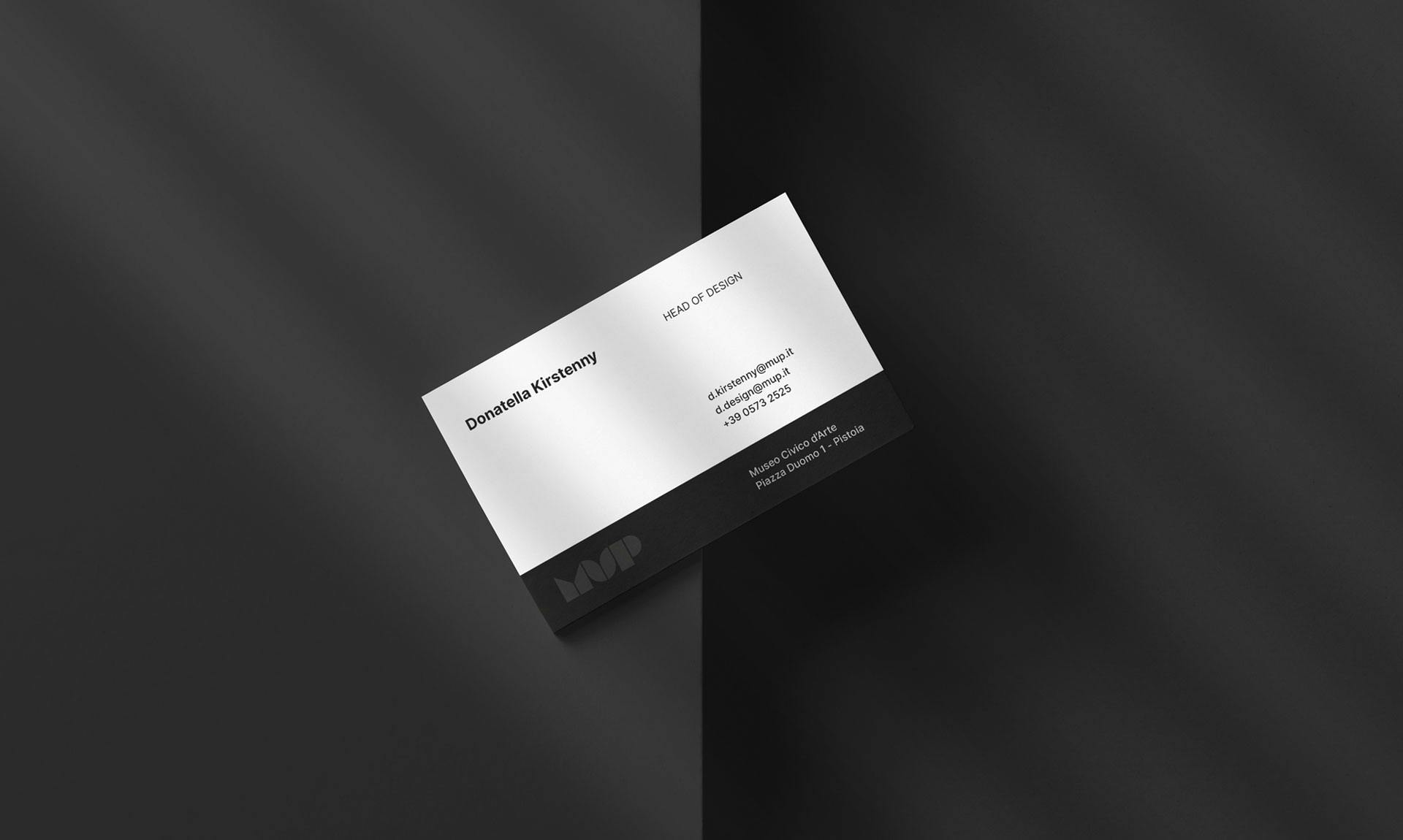
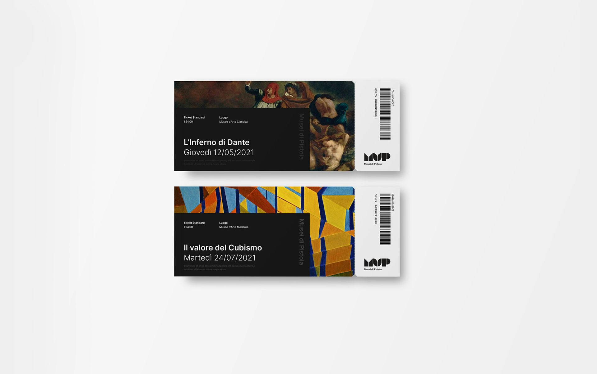
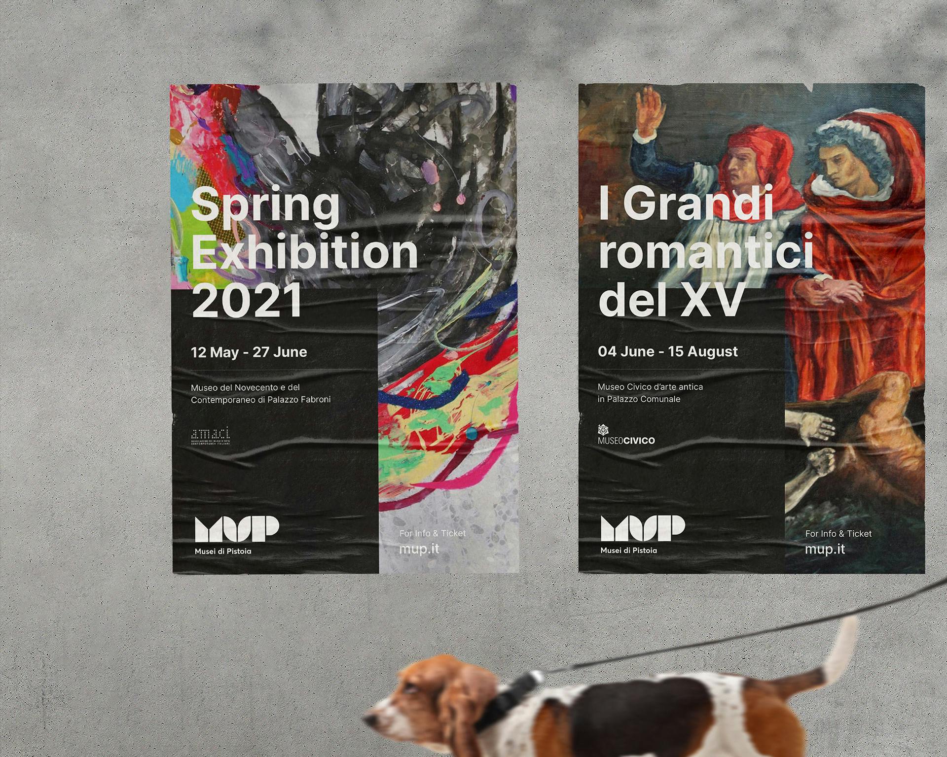
The logotype will be adapted for each venue in the museum system through variations in color and lettering, allowing maximum flexibility and a strong visual identity.
This is a concept submitted for the call for proposals.