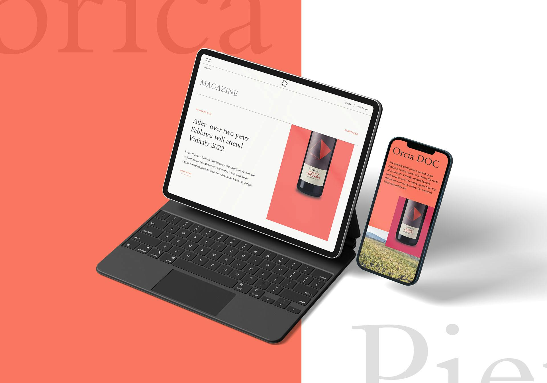

Notary Firm
Discover the branding work our design team created for a notary firm in Milan and Lecco

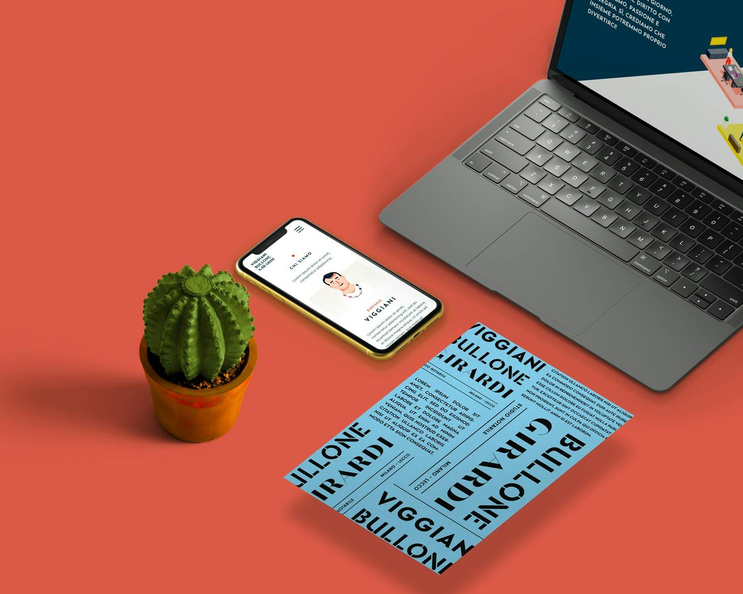
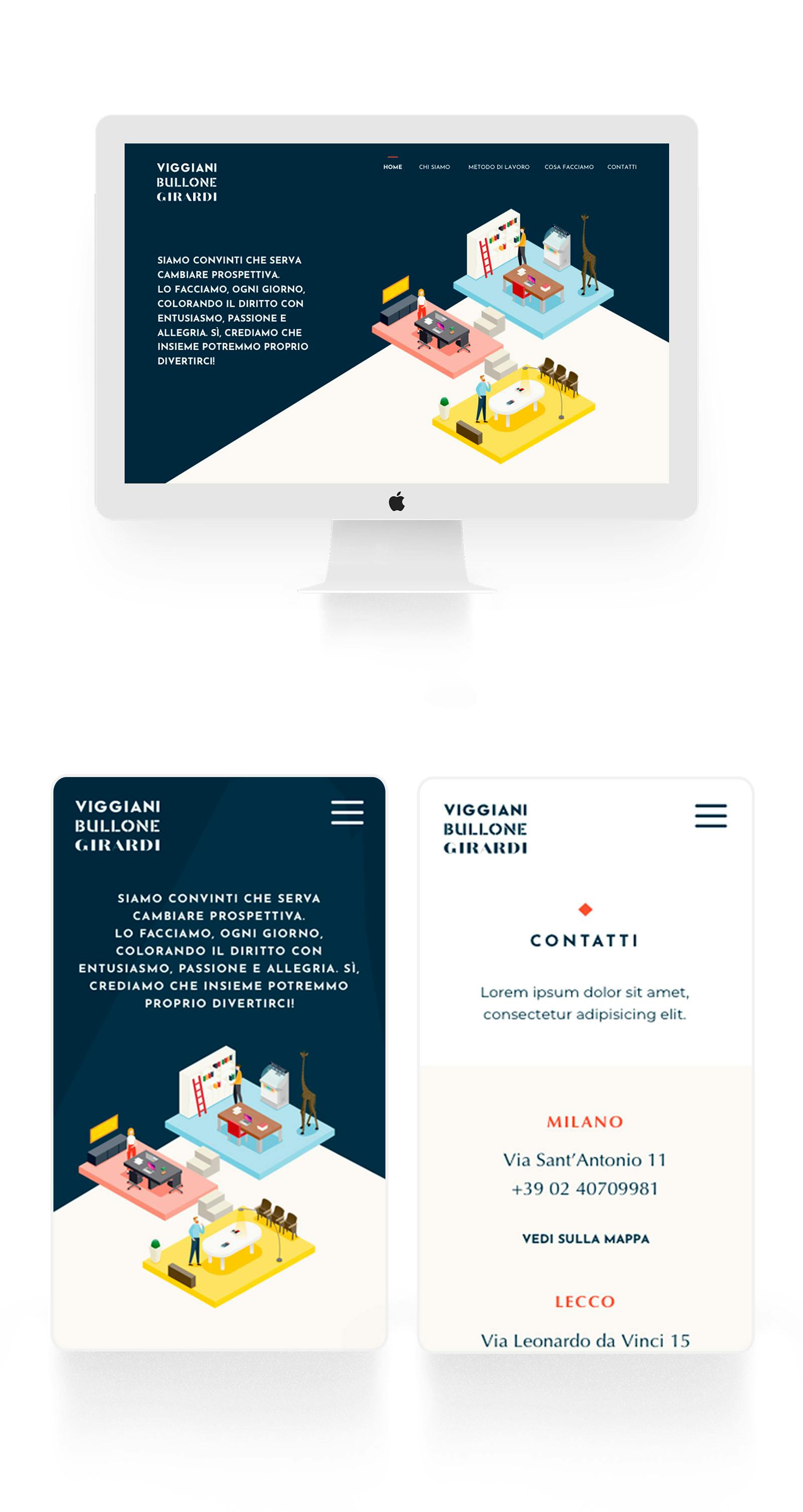
The notary firm, with offices in Milan and Lecco, needed a new brand identity and a new website reflecting the fresh, fun spirit of its partners, breaking away from the old-fashioned, monotonous approach to clients typical of the notary world.
The goal was to blend a young, empathetic spirit with top-tier legal expertise, speed of execution, courtesy and straightforwardness.
Designing the new logotype
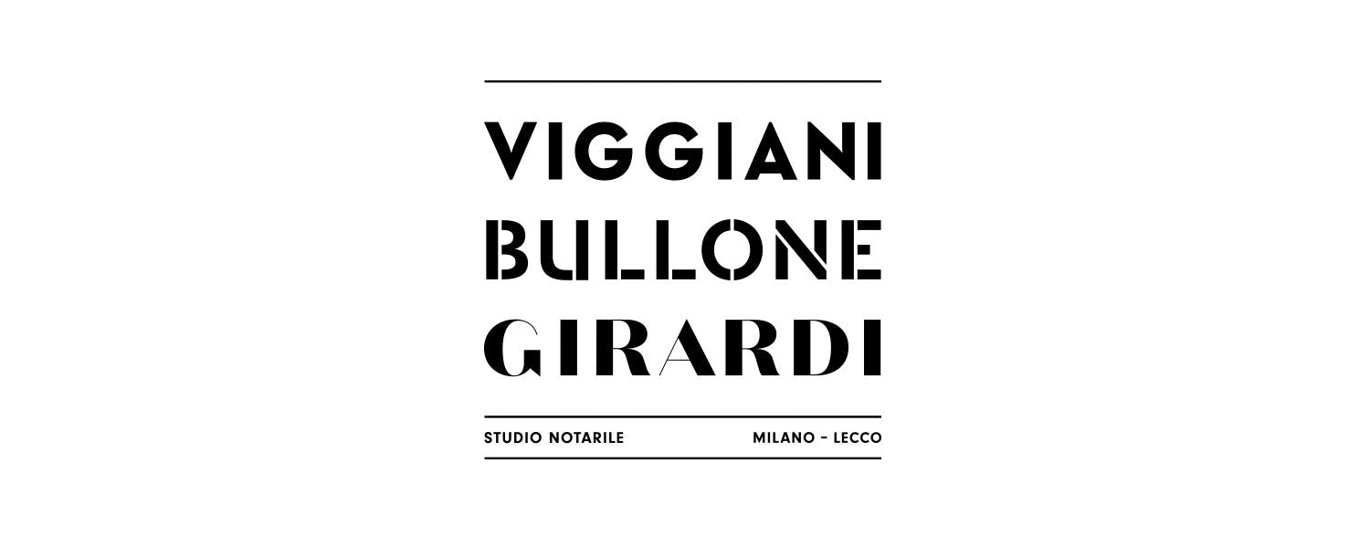
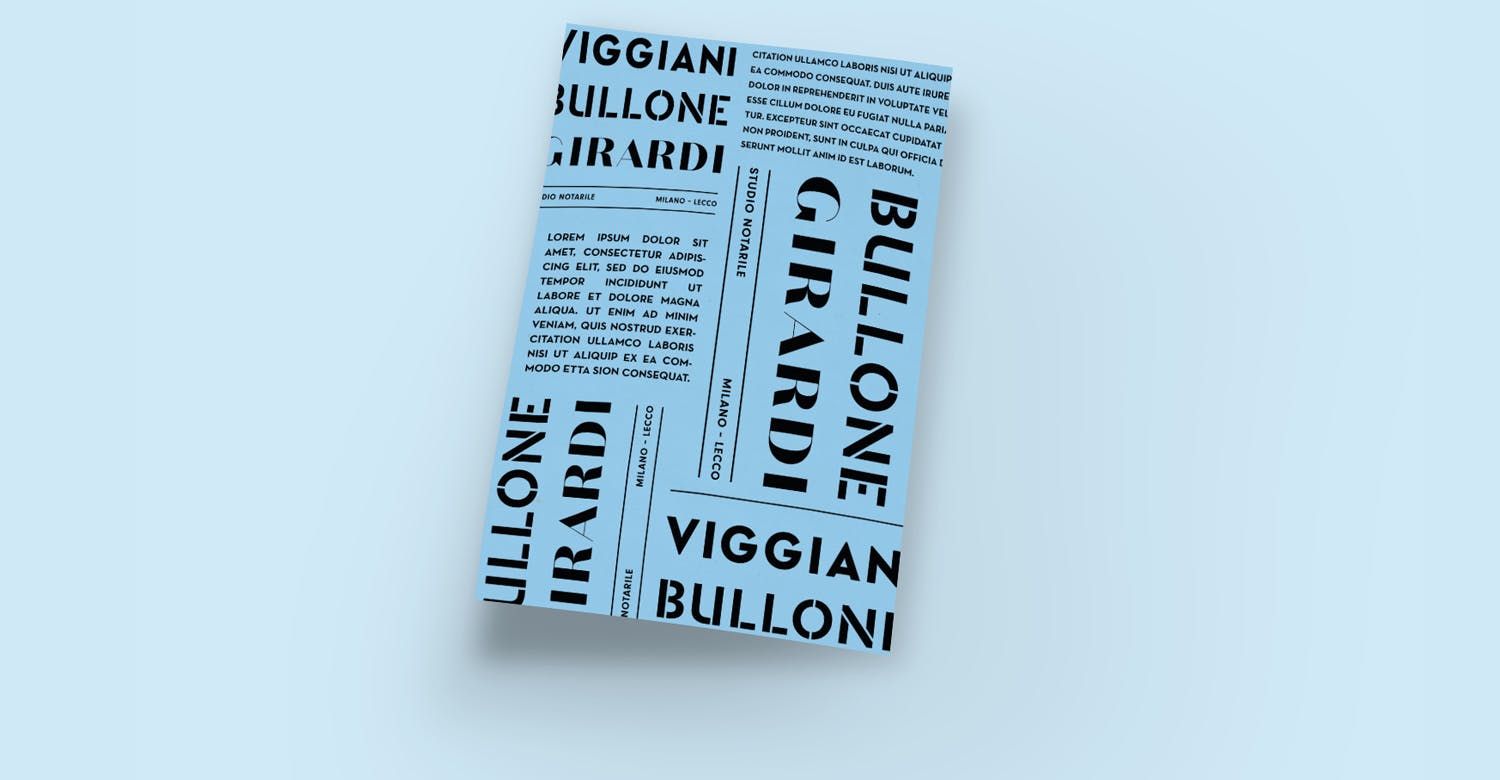
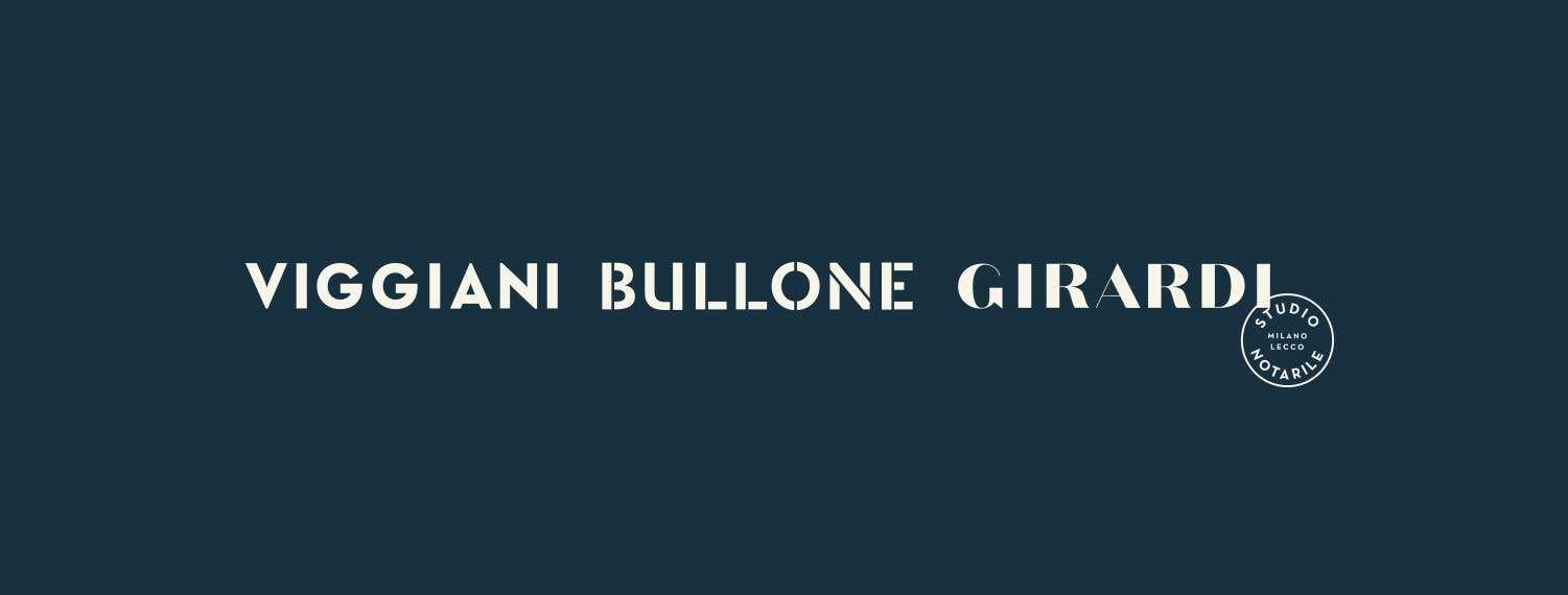
Alongside a brand-new website, the firm needed a rebrand and therefore a new visual identity. We worked on a logotype rather than a symbol, to avoid being intrusive or cryptic and to connect the firm as directly as possible with the people who work there.
We used three typefaces to highlight the personalities of the three partners and keep the work young, fresh and clean.





Color palette and typography
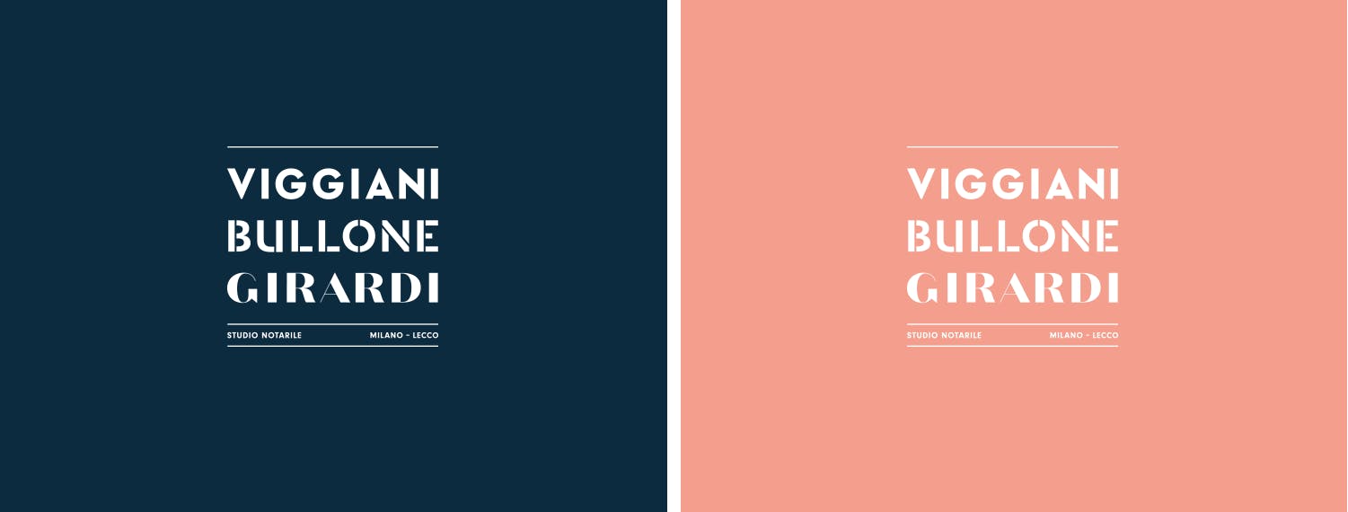
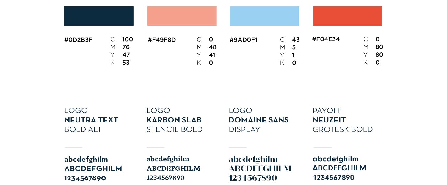
To reflect the firm's dynamic, modern identity, we chose a lively, distinctive color palette that pairs warm, welcoming tones with bolder accents. These colors aim to convey professionalism, approachability and an innovative mindset.
On the typography side, three different typefaces represent the different personalities of the firm's notaries, striking a balance between tradition and modernity. This combination supports clear, engaging communication and strengthens the firm's visual identity.

Illustrations
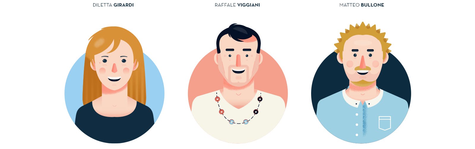
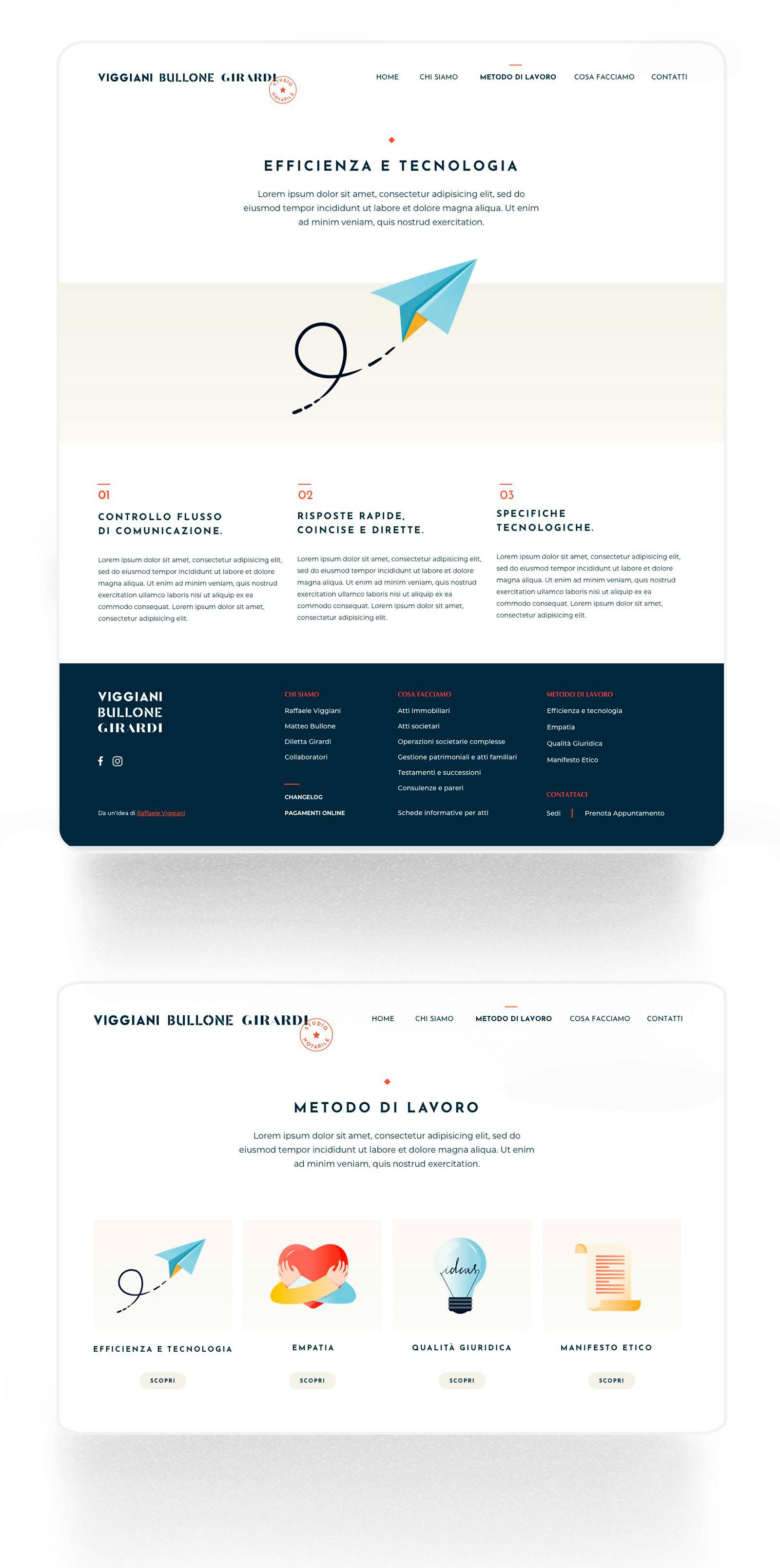
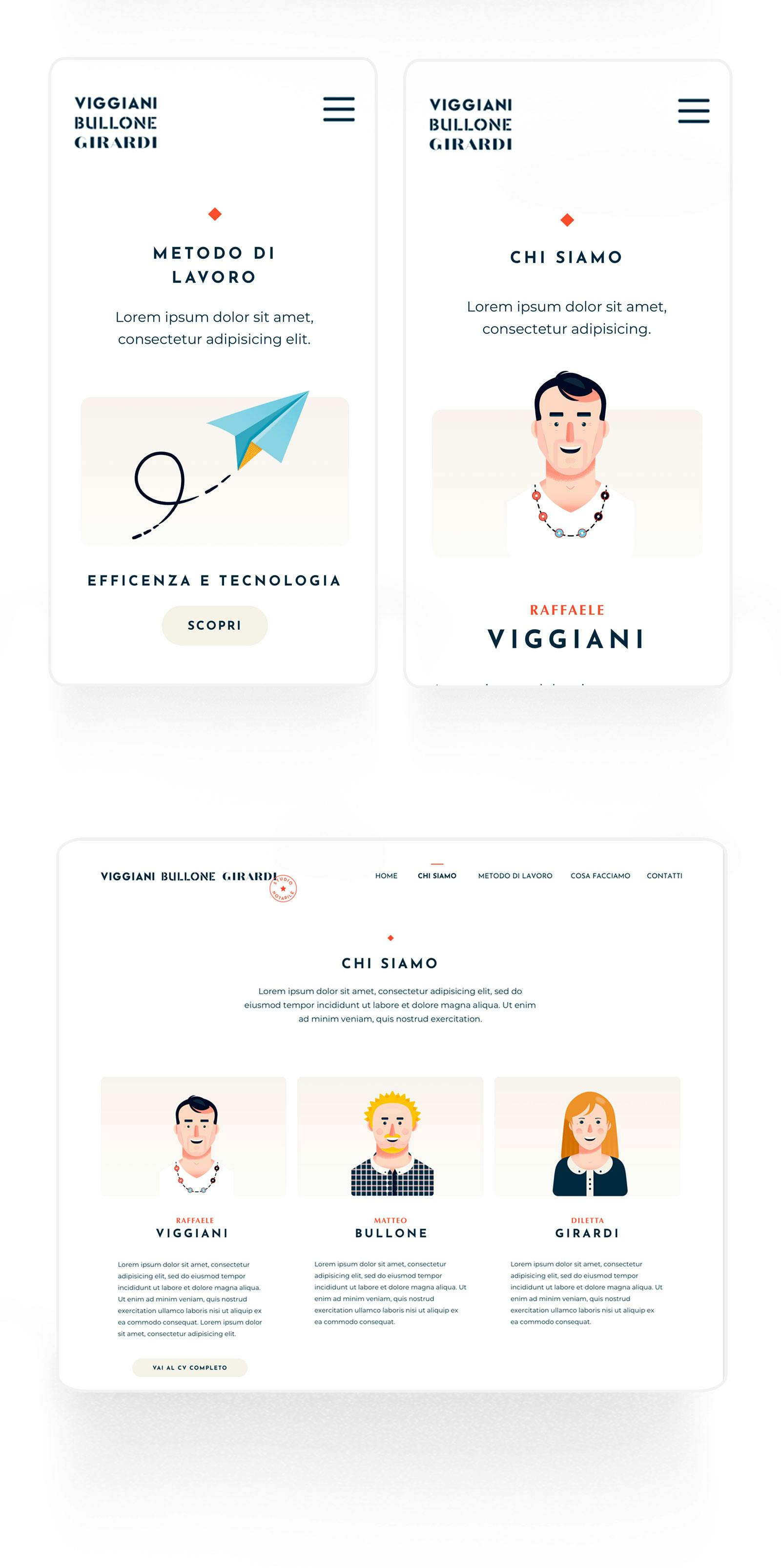
We favored flat illustrations to bring the website to life and meet the client's brief (a modern, colorful, youthful website). We started from the three members of the firm, emphasizing their distinctive traits, and went on to find a visual translation for each area and field the group works in.
The illustrations were essential both to stand apart from industry standards and to reflect the firm's character.