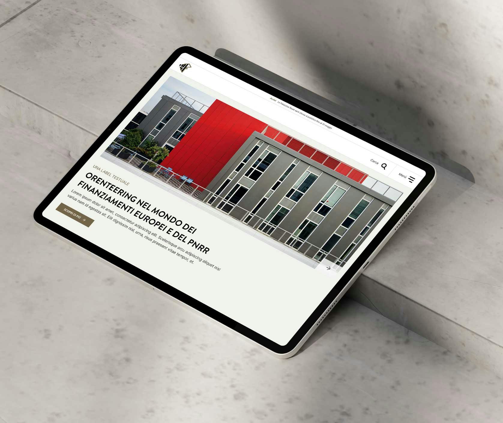

Ordine Degli Architetti Firenze
The Ordine degli Architetti shares its digital spaces with the Fondazione Architetti Firenze, whose mission is to promote and share cultural and research activities that keep architects, planners, landscape architects and conservators up to date in their profession.


A large, complex website
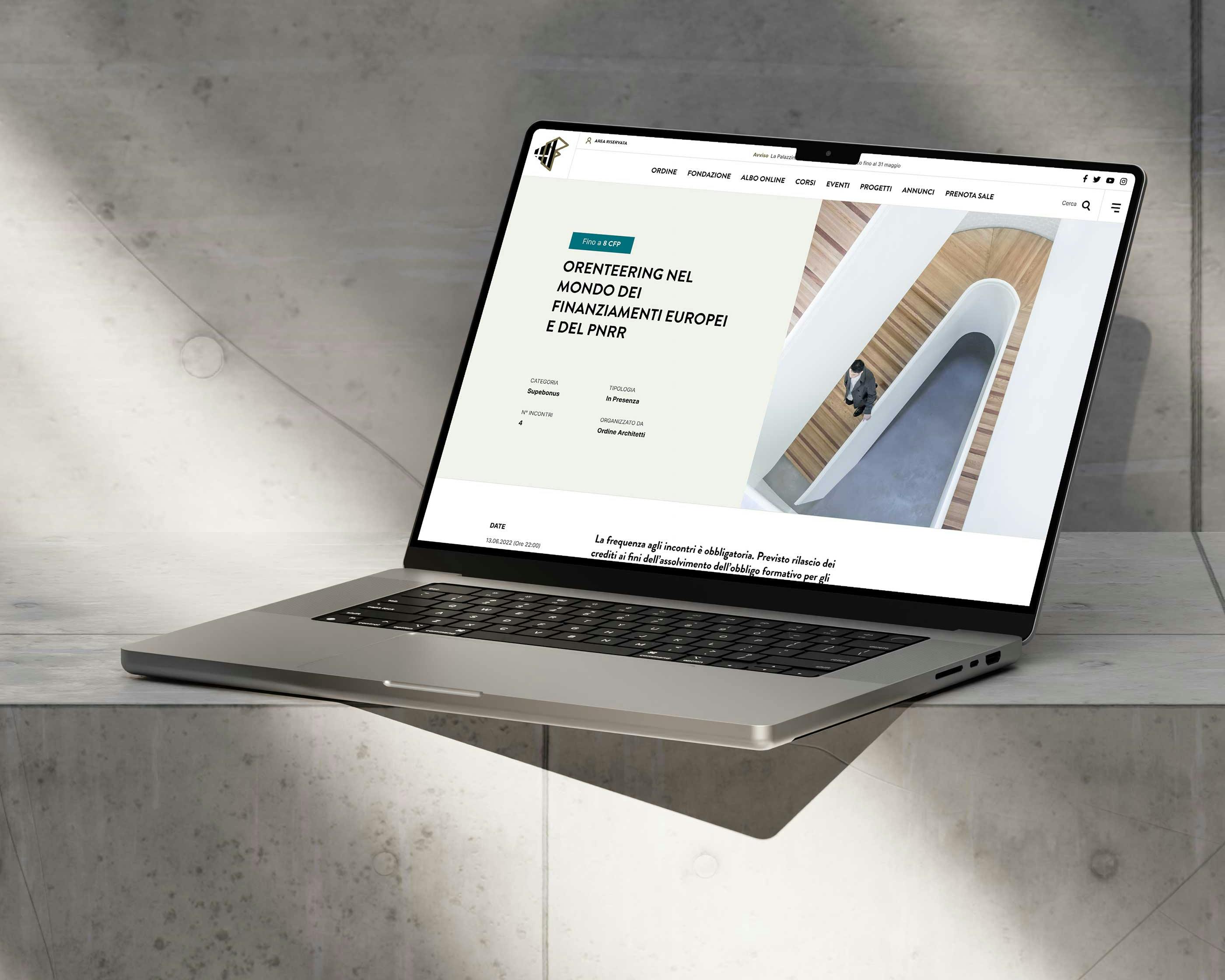
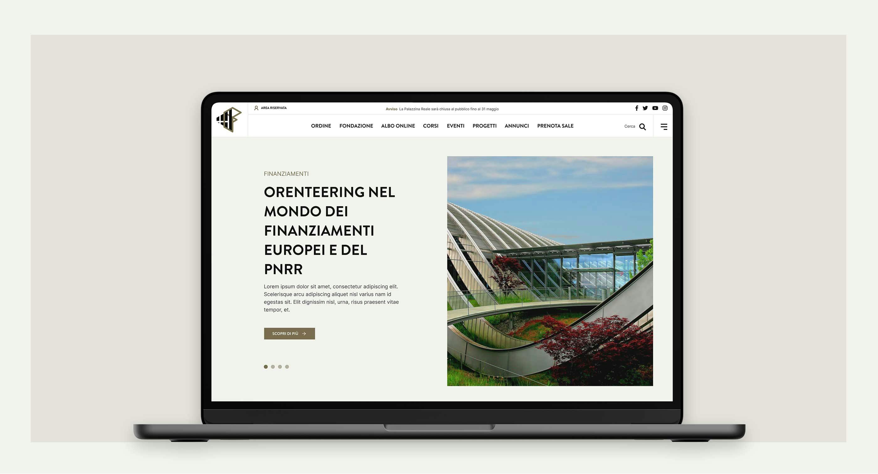
The challenge in building the new Ordine degli Architetti website was creating a smooth, simple browsing experience within a complex structure that required very different sections in terms of user types, functions (informational, educational, professional) and menu items.

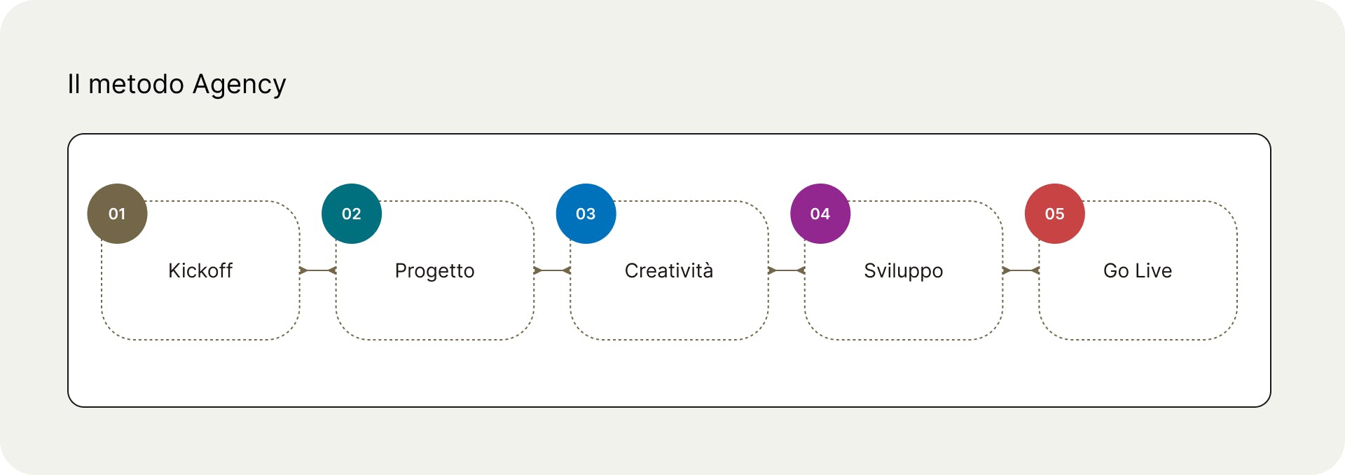
We carried out an extensive research phase, with UX workshops and qualitative and quantitative studies, before starting the actual design work.
To avoid delays or producing material that doesn't fit the client's goals and needs, we always follow a rigorous five-phase method.

Simplifying depth
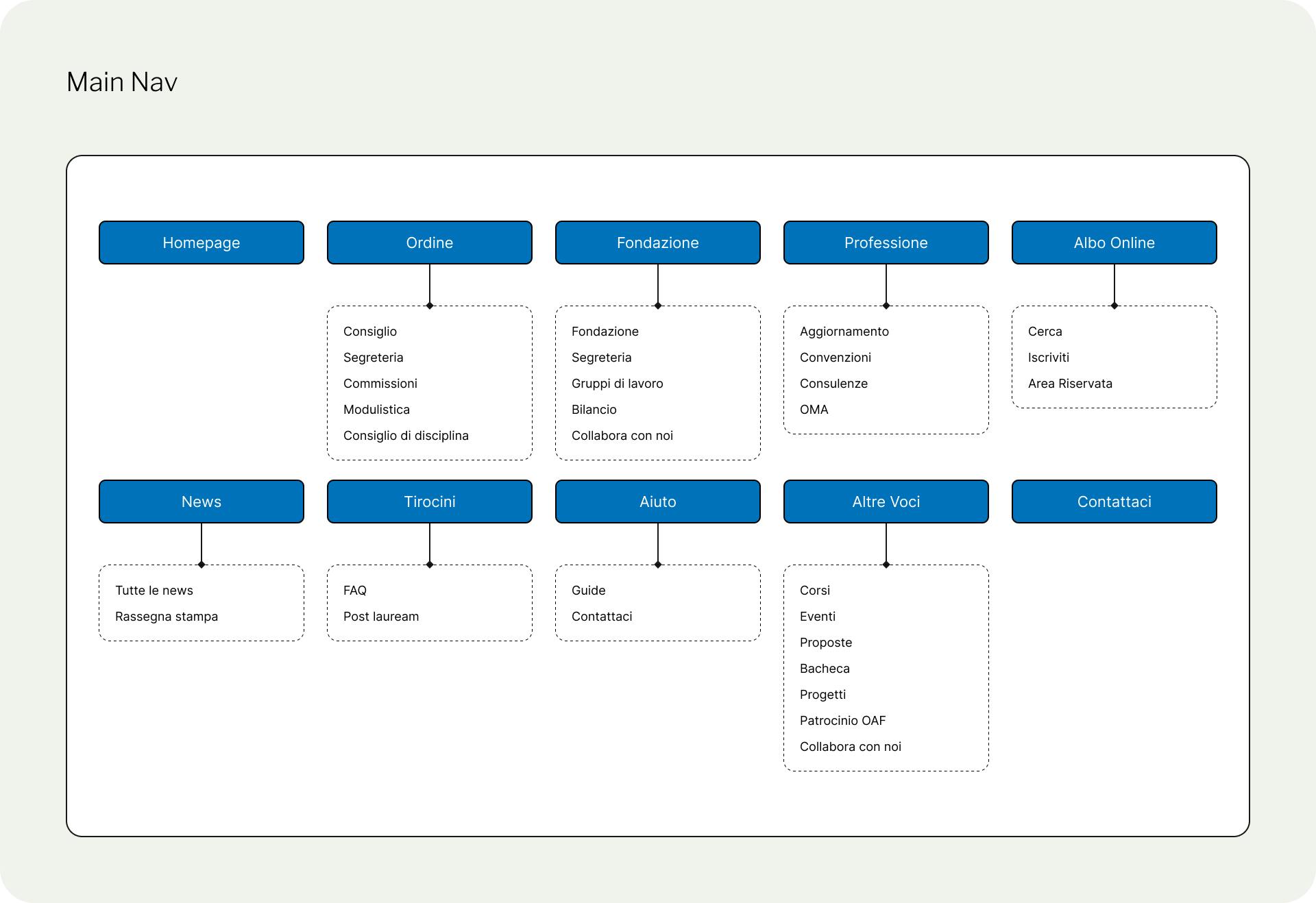
In the information architecture and template modeling, we reduced page depth as much as possible, and with it the number of clicks needed to reach any piece of content.

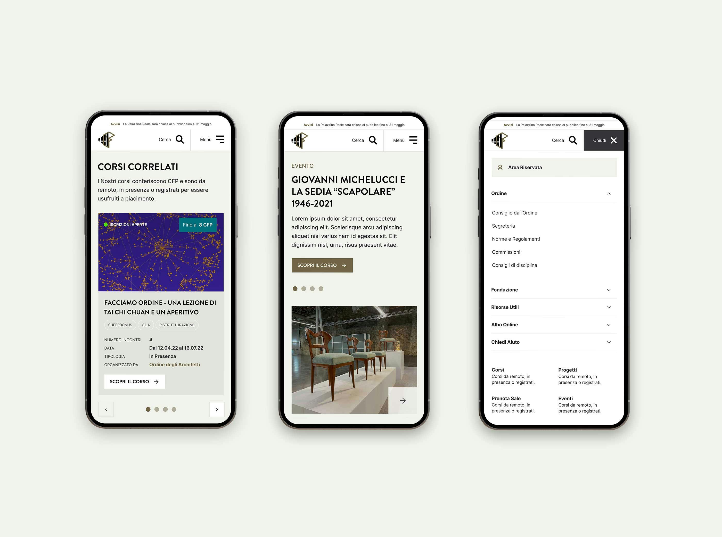
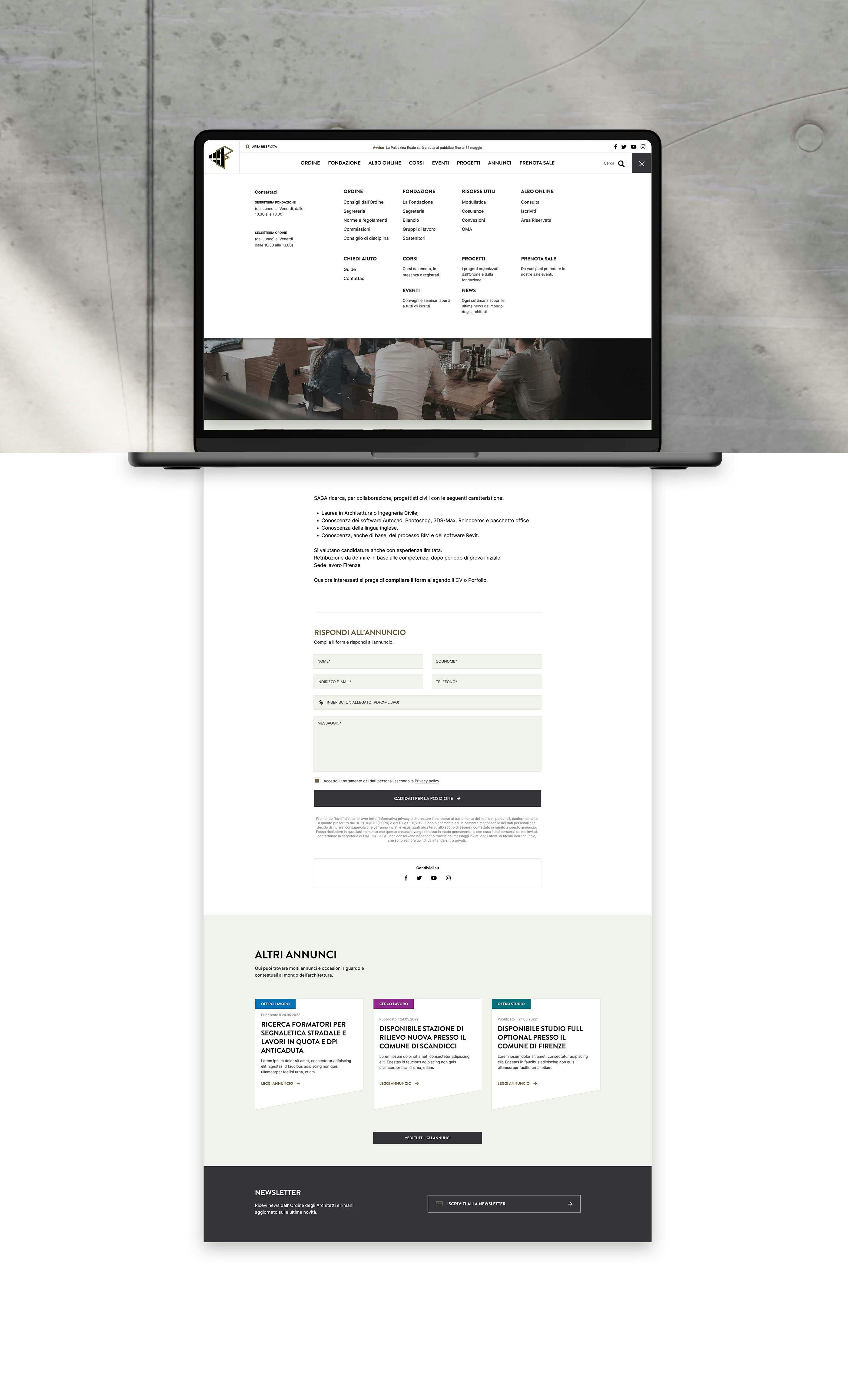
We also created a dual menu: a main one offering a selection of the sections users visit most, and a secondary one with most of the pages useful to users with more specific needs.

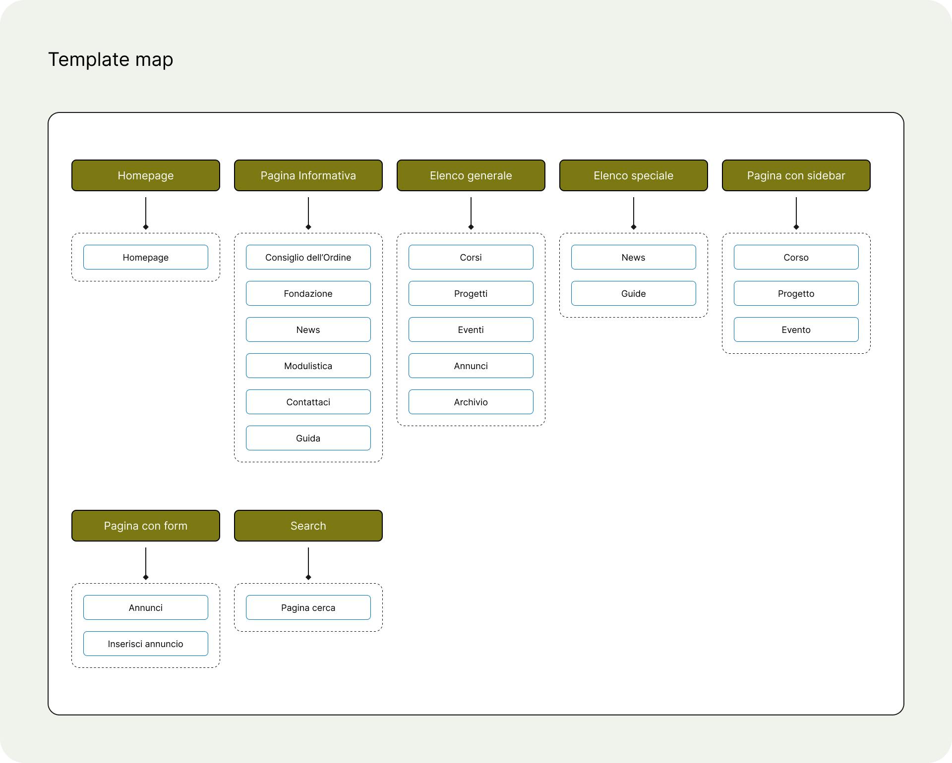
Clearing up doubts in low fidelity
Every template was turned into a low-fidelity wireframe to check whether the planned user flow translated into cohesive, satisfying on-page experiences.
The blocks sketched in these wireframes are then turned into the UI elements that get developed.


Smart, modular UI
The interface required extensive optimization and simplification so that many blocks could easily adapt to multiple templates and formats, often starting from the same design "atoms."
This made it possible to create fully modular templates that give editors the freedom to build new digital experiences from a wide range of pre-styled, ready-to-use blocks.


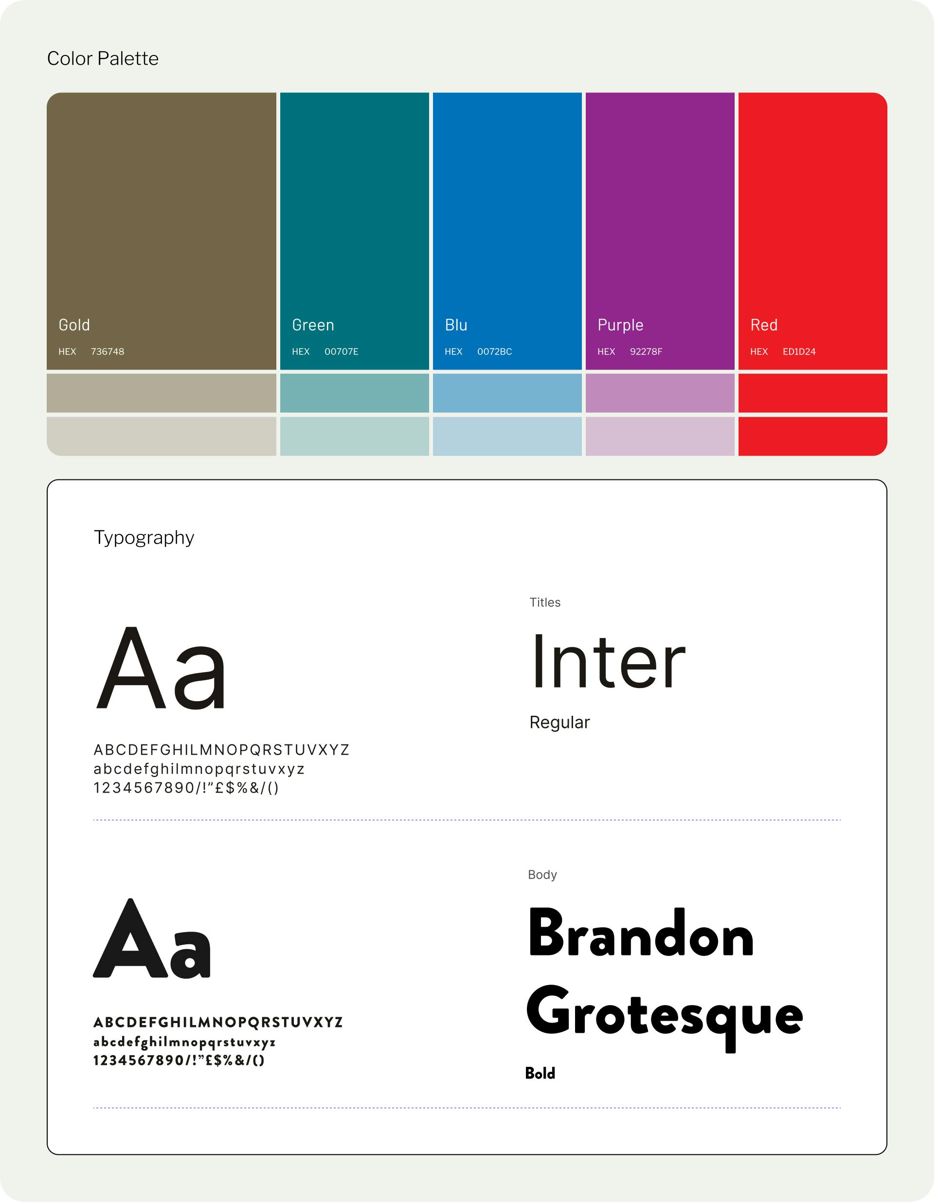
Color palette and typography
We used color not just for aesthetics but to carry meaning: content is distinguished by a different accent color depending on its category. That's why, alongside the brand colors, we chose a bright, vibrant palette.
For typography, we chose a mix of two different but complementary sans-serif fonts: Brandon Grotesque and Inter.

No barriers
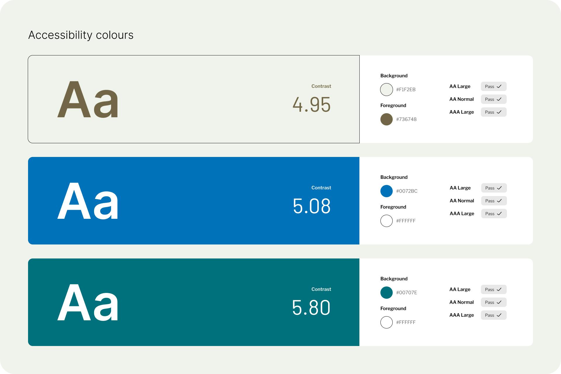
The Ordine degli Architetti di Firenze website was designed from the ground up to be accessible, ensuring it can be navigated by mouse, keyboard and voice.
The site's content was made compatible with screen readers, with particular attention paid to the contrast between backgrounds and text so it's always legible.

A modern stack
The site was built with DatoCMS at its core, using NEXT.js for page generation and netlify for content delivery.
Although it is highly visual and packed with content, the website delivers enviable performance even on mobile networks.