

CSS Day 2020: where accessibility stands
Web accessibility has been talked about for years, yet it has drawn only lukewarm enthusiasm. This year we attended CSS Day 2020, and Massimo Artizzu's talk brought our attention back to the topic and gave us fresh food for thought. Could this be the time it finally takes off?


Every year, CSS Day is an event we try never to miss. It's a key moment of reflection for us, a chance to compare notes with the industry community and the state of the art while getting together in person. This year, for obvious reasons beyond anyone's control, Italy's most important CSS conference was held remotely, so participants could only meet virtually. It was a new and interesting experience in a format that was unprecedented, at least for us. In a way, this remote edition of CSS Day brought communication closer, because it put everyone in the same room, in the same conversation. But for us, since we didn't know most of the participants personally, partly because of the geographical distance, the screen in between didn't help us take an active part. In our case, we interacted among ourselves on our own call, a bit as if we were sitting side by side.
Web accessibility
My favorite talk was Massimo Artizzu's, which this blog post draws on heavily, and I'm very grateful to him for bringing it to CSS Day 2020. Web accessibility is a topic close to my heart, and one that calls for a cultural shift to embrace it. It's been discussed for years, and I like to picture it as a drop of water that, with its small but relentless force, eventually wears through even rock. It's a deeply ethical topic, a practical one and, let's admit it, a bit boring compared to design trends chasing wow effects and visual impact. As Massimo puts it:
It requires a paradigm shift, where accessibility is taken into account at every stage of the process: from design to writing code to final testing.
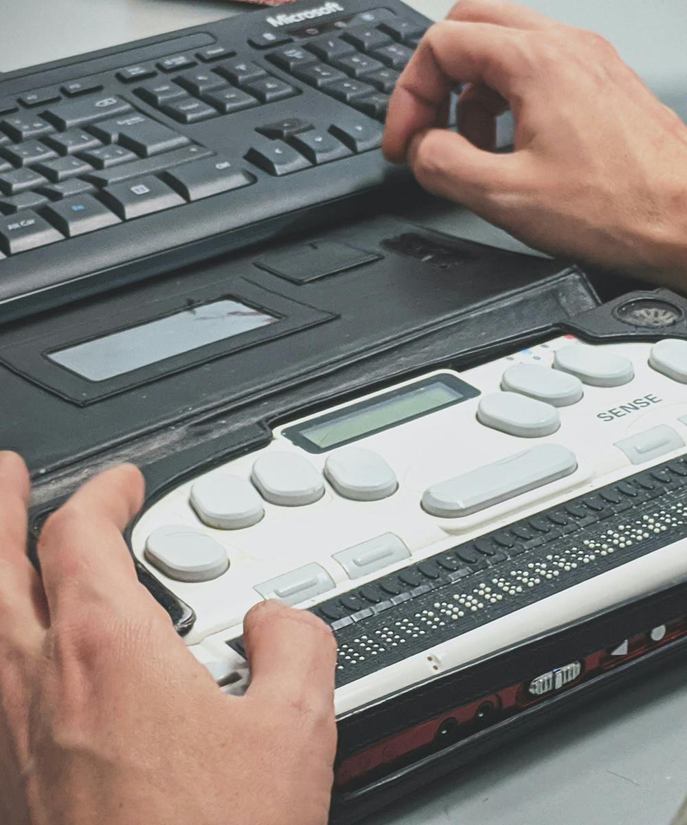
First of all, accessibility isn't just for blind people, it's for everyone. As users naturally get older, even minor vision problems such as presbyopia become more and more common. So what we see clearly today may be hard to read in a few years, even with glasses. Accessibility shouldn't be seen as a hidden corner of the work of those who design and build UIs, but rather as an integral part of the goals we normally set for any user. Making a website accessible improves the browsing experience and the quality of the work. While it's easy for us to see and picture the product we're building on a regular screen, mobile or desktop, it's not as easy to understand how a screen reader interprets our app's output, and therefore how the product will be perceived and used by people with impaired vision or no vision at all. Massimo explains very clearly and simply that a screen reader reads in a single direction, much like a responsive website's mobile view. Great news! It means working mobile-first is also a great way to check whether the order of the content and its reading flow make sense to a screen reader. And we can go further, because accessibility isn't only a solution for blind people: it also lies in the small things that shape any user's experience, like adequate font sizes, a line-height that ensures optimal readability, icons with clear labels that leave no ambiguity in context, and color palettes that don't strain the eyes under different lighting conditions.
Beautiful design vs. accessible design
This debate has been going on for years and is still unresolved. Some think the two worlds can't be reconciled, others try to find a middle ground, but not everyone is convinced the question is framed correctly. A UI that offers clear, accessible content to people with visual or cognitive impairments is still a UI that works well for everyone. The best example I can give is the website of Nielsen Norman Group. Font size, together with color contrast between text and background, is a hot topic. Browsers like Chrome have recently built in handy measurement tools to help us check whether these two parameters meet accessibility requirements. We won't claim to settle the issue; if anything, we'd like to widen the discussion: what's the relationship between the expressive and communicative functions of the UIs we build in 2020? We can all see that, over the years, web design has moved toward UIs that look alike: flat, simple, but extremely communicative and effective for their goals. We can see this as a consequence of UX research fields growing and specializing, in close dialogue with business needs. From this angle, adopting accessibility as a paradigm would seem inevitable. But it's not that simple. Something doesn't fully satisfy us. Maybe we're nostalgic for the old pioneering web. Maybe the aesthetic, expressive side of visual communication still demands its space, even and especially in products like web UIs, where attention spans keep getting shorter.
New media queries
New technical tools have recently come to the rescue. The problem, and the challenge, lies in reconciling many needs in a single UI. But responsive design has already taught us to think about and build UIs that exist simultaneously in different forms and interaction modes. Media queries are tools that let us understand the context of the user of our app, and adapt the UI and UX to their preferences. The one anyone who's built a responsive website has used is based on window size, and lets us know, or at least guess with reasonable confidence, whether the site is being viewed on a smartphone, a tablet or a desktop. With Interaction Media Queries we started refining this by also looking at the user's input method: touch or not, precise or not. With Media Queries Level 5 we can go even further and find out whether the user has specific needs:
- prefers-reduced-motion
- prefers-color-scheme
- prefers-reduced-transparency
- prefers-contrast
Knowing all this, we can set up a UI suited to those specific user needs and offer alternative, accessible versions of carousels, parallax effects, animations and transitions, as well as color schemes and contrast ratios that match the user's request. Not all of these new media queries are supported by browsers yet, but they may be a further step toward creating UIs increasingly tailored to users' specific needs.
Accessibility at Cantiere Creativo
In 2017 we received our first explicit request to meet accessibility requirements in a web project: the website of the Gallerie degli Uffizi. We tested the product with various tools and built a high-contrast mode that users can turn on directly from the UI. A small feature, but it let us offer a more refined and visually rewarding website in the “standard” version, and a more readable one in “high contrast” mode.

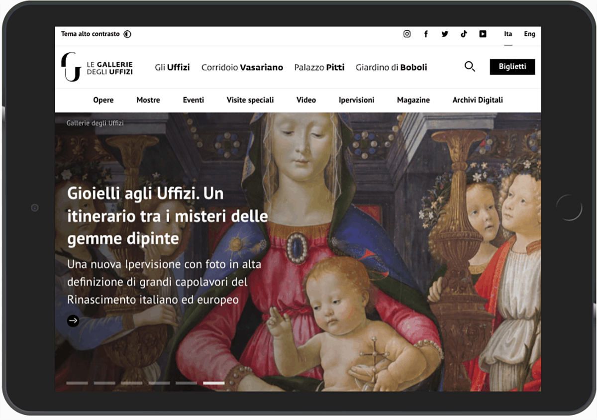

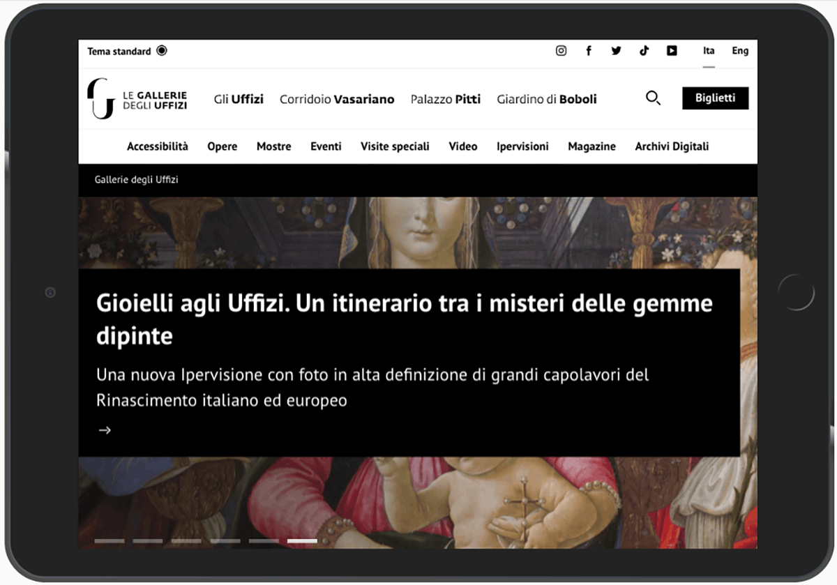
We know that, for now, most of the products we build still need improvement on this front. But the path is set, and for a few months now we've been actively working to build accessibility into our workflow and finally make it the default, at least for all the requirements that can easily be tested automatically. It's also worth noting that after the famous GDPR, a new European regulation came into force last year: the European Accessibility Act. We don't yet know how much of a concrete push this will give to adoption or how it will fit with Italian legislation on the subject, but we're following it closely. Who knows, maybe 2020 will be the year the drop wins over the rock :)


