

How to create landing pages that deliver results
Sometimes we have the right product, the right messaging and ad campaigns driving plenty of traffic to our site, and yet the conversions just don't come.Why aren't we getting the results we hoped for? Often it's because we're missing a key part of the conversion process: a landing page optimized for our goal.



Landing pages are still essential tools for any marketing campaign built on converting incoming traffic, paid or organic, because they help users focus on the core message only, cutting out all the background noise. Let's look at how to build the perfect landing page for our marketing campaigns, using a template based on international conversion best practices.
Tabula rasa
We often have the copy, the ad creatives and a great email campaign ready to push our conversion goal, but when it's time to add that all-important inbound link to our site, we realize we don't have a real landing page template. What usually happens is that, to save time, we create a blog post or a simple internal page and hope to get the message across from there, but unfortunately it is unlikely to convert. Landing pages are an exercise in subtraction: anything that isn't absolutely essential to help the user convert must be removed from the page. For example, it's common practice to remove the navigation menu, so users don't wander off to other pages while reading. You should also remove any secondary CTAs on the page: if the action we're asking users to take is downloading our guide, a "Subscribe to the newsletter" button above the footer risks distracting them from the right action. A good example is the landing page of edupath aimed at parents of teenagers looking for college prep tests.


As you can see, there's no navigation menu and the CTA follows the user as they scroll, to maximize the chance of conversion.
A good headline is everything
In copywriting and content marketing, nobody disputes the importance of headlines. An effective, on-point headline can turn even a mediocre campaign into a great investment. Unfortunately, the opposite is also true: we may have built the best landing page of all time, but if the headline doesn't grab the reader's attention, they'll ignore everything else we crafted so skillfully. The numbers don't lie: 80% of users read the headline as soon as they land, while only 20% stay to read the rest of the text.A good headline should:
- talk about the user, not about us;
- make the value of the offer clear;
- be written in simple, fluent language.
An effective headline can increase conversions by up to 35%, so it's imperative to work on it with special care.
First impressions are what count
Page design, typography and supporting images and videos are essential to make sure the first impression is a positive one. This is especially true of the Hero Shot, where most of the user's attention is won or lost.The Hero Shot is the part of the page that conveys the brand's value proposition, often with persuasive copy paired with visuals such as video, photos or illustrations. It usually sits "above the fold", the part of the page visible as soon as it opens, and therefore the part that holds the headline and the CTA. It follows that most of the design and copywriting effort should focus here. The visual that accompanies the text generally falls into one of 3 types:
- A depiction of the product.
- A depiction of the context of use.
- A depiction of a prominent team member.
The third option obviously makes sense when the product or service is tied to a well-known figure in the community, an influencer or an international star. Masterclass, for example, doesn't need to beat around the bush: a short video of one of the greatest players in NBA history is enough to convey the value of the offer.


Speaking of video: whenever possible, use video in the Hero Shot, because it can increase the conversion rate by up to 80%. Just keep an eye on page weight to keep load times down!
Call to Action: the gateway to conversion
The Call to Action (or CTA) is where we really turn a visit into a conversion, or lose it. It's the text, often inside a button, that asks users to take an action (sign up, try the demo, watch the video, download the ebook, etc.) to get the benefit they landed for. Even though it's often little more than a handful of words, we can't underestimate the impact a weak CTA can have on conversion rates, or one that doesn't stand out enough. If you're getting plenty of traffic but no conversions, try a quick review of these four aspects of your CTA:
- Text: Does it create a sense of urgency? Does it communicate the value of the offer right away? Is the requested action clear?
- Position: Does the user's eye land easily on the button, or is it distracted by other elements? Does it follow the reader's scroll, or is it repeated?
- Size: Is it too small? Is it so big it distracts from the text? Is it clearly the main action on the page? Is there enough negative space around it?
- Color: Does the button stand out against the background? Does the color relate to the rest of the page and brand palette?
Keep in mind that even small changes, like a different button shade, could raise the conversion rate by a few precious percentage points.
Customer-centric, benefit-driven messaging
People landing on the page for the first time are probably looking for a solution to a problem or a way to fulfill a wish. The landing page must focus entirely on the benefits of the offer for the user, talking about ourselves as little as possible and letting our service or product speak for itself. When writing and building a landing page, let's put ourselves in the reader's shoes and ask: "So what?" (for extra impact, you can use a more colorful expression from Roman dialect, which I'll leave to your imagination). Reading the copy, do we find real value and benefits, or dry (if not sterile) feature descriptions? Is the user satisfied, or left without an answer to a resounding "So what?". Let's take an example to clarify. Suppose our landing page offers business management software and contains these two sentences:
- "Cloud-based software."
- "Easy to use."
While both are benefits, the first is too abstract and the second is unsupported. These two statements wouldn't pass our test, because the user would have to make the effort of imagining where the real benefit lies. To avoid the "So what?", we could phrase the two points like this:
- "Nothing to install, and it goes wherever you go, even on your phone."
- "Create your account and start working right away, without wasting precious hours on training."
These are two real, tangible benefits that speak for themselves and make the value of our offer clearer.
Let customers do the talking
Social proof (social proof) is a term coined by Robert Cialdini in his book Influence to describe a psychological and social phenomenon in which people, when in doubt or uncertain, tend to copy the actions of the majority, on the assumption that it has more information. Social proof is one of the six heuristics in the social psychology of persuasion, and it's a valuable marketing tool, especially on landing pages, where we have little room to convey all our value. Here are some examples of social proof we can use:
- Numbers that show the public's trust in the brand ("More than 45,000 downloads in 2020").
- Quotes and reviews from users who match the landing page's target audience ("I've solved my job management problems since I started using this software. Highly recommended!").
- A visual list of all the major brands that use our product or service.
You can use several kinds of social proof on the same landing page, so there's no need to worry about overdoing it... as long as the testimonials and numbers are true! Let's see how Basecamp uses them, for example:

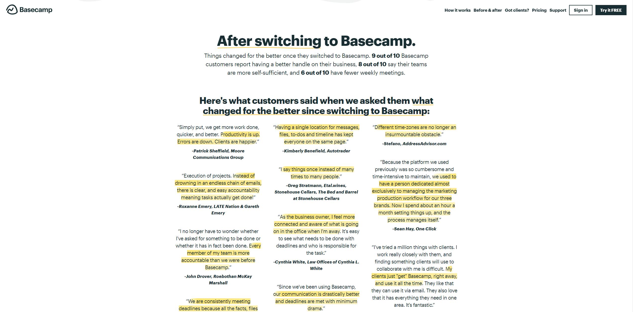
And then it closes with a footer that screams social proof from every pixel:

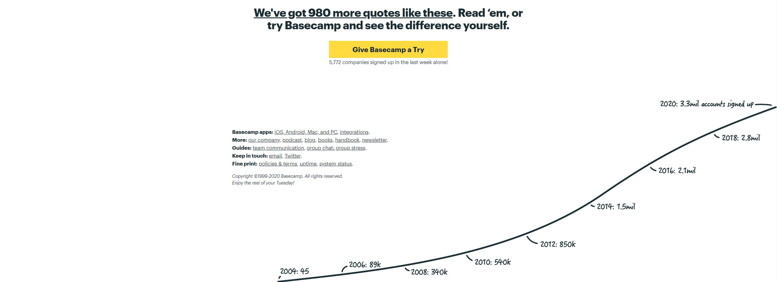
If you have awards from well-known institutions (think of the landing page for a film that won a David di Donatello, or a hotel that won a TripAdvisor award), it's not strictly social proof, but use them anyway, because they build trust in the brand just as well.
Mobile first (and last!)
More and more often, people browse the internet, read email and open paid promotions on the go, on their trusty smartphones. On one hand, this helps us reach people who aren't sitting in front of a computer screen; on the other, it presents some non-trivial challenges:
- Producing engaging content in limited horizontal space.
- Creating a design that offers a conversion-optimized browsing experience on every format.
- Making conversion actions, such as signing up for a service, as frictionless as possible.
When planning a landing page, always ask how it will look on a small vertical screen and how we can offer the best browsing experience to whoever lands on it.
As many tests as stars in the sky
Despite all the words in this post, there's no universal formula for the ultimate landing page. Every audience responds very differently to copy, images and benefits, so stopping at the first iteration of a landing page always leaves you wondering whether you could do better. Running A/B tests that compare the results of two landing pages is usually the most common (and easiest) way to optimize the conversion rate. You can easily test:
- the headline;
- the text of the Call To Action;
- the Hero Shot;
- the button design;
- the button color;
- the length of the signup form;
- the length of the copy.
The major digital advertising platforms, as well as email marketing ones, offer simple, clear ways to test the different parts of your landing pages with ease.
Conclusion
When done right, landing pages can generate the highest return on investment from marketing campaigns, while precisely positioning the brand in its target market. There's no single formula for an effective landing page, so never forget to test your landing pages on real users who match the product or service's target audience, to see empirically what works and what doesn't.


