
Museo Civico Comune di Siena Branding

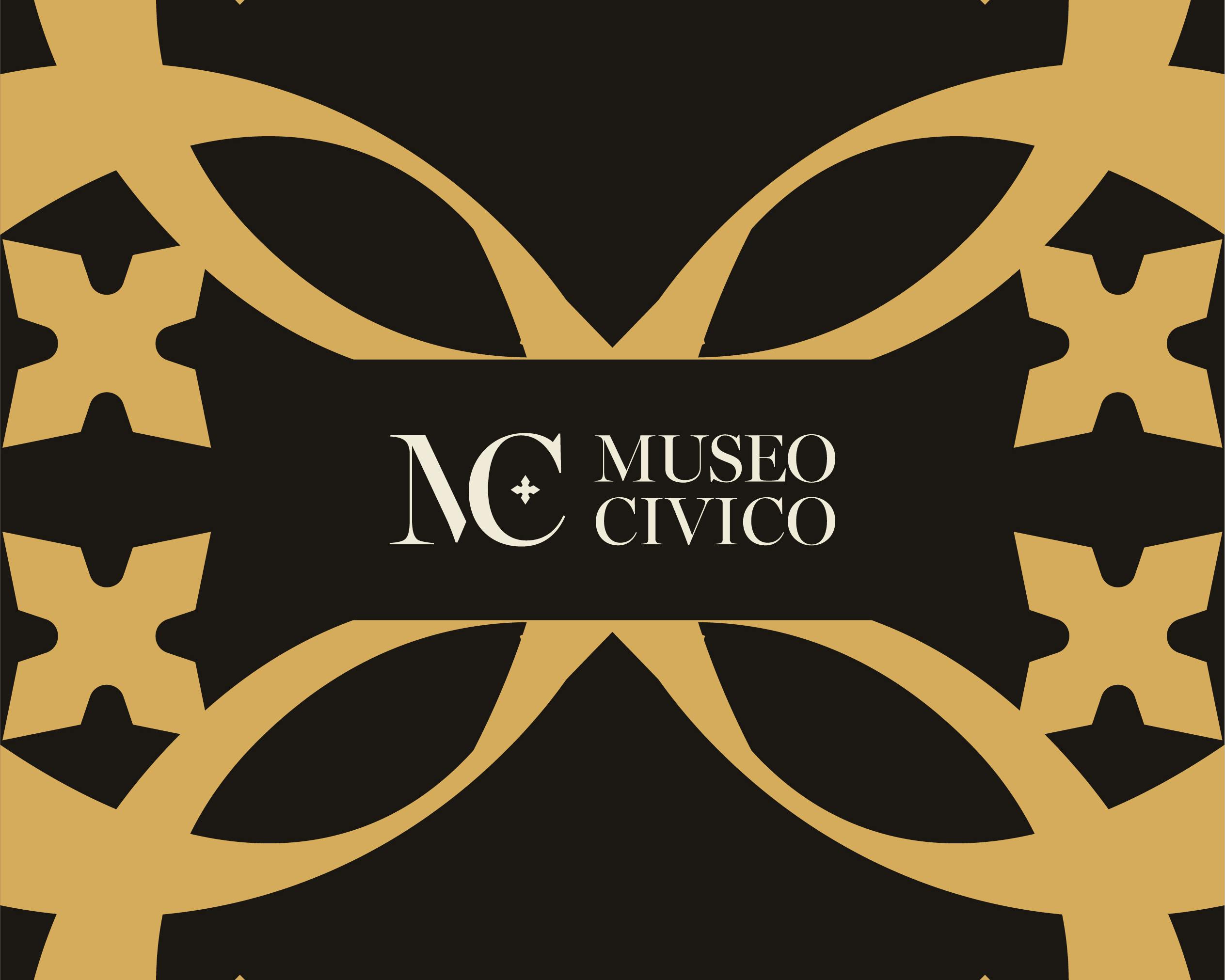
The monogram is made up of the joined, partially overlapping letters M and C. The M is partly covered by the C but always remains recognizable. Inside the C is a symbol that graphically recalls a detail often found in the paintings and carved into the palace walls, making the monogram unique and recognizable.


Visual identity
The logos of the world's greatest museums are often minimalist, typographic, abstract and simple. They act as marks that present the museum's name in a recognizable, unique way, without trying to say everything about the museum. It's the more elaborate elements of a brand's visual identity that further reflect a museum's content and character. That's why the Museo Civico identity plays with the colors and shapes of the logo by overlapping the mark itself, creating a new, fresh universe that is also inclusive and accessible.
The patterns created by combining the shapes recall the vibrant, intricate frescoes inside the museum, while the final result has a modern, new look.
The museum's visual identity works well in print, on posters, welcome banners at the museum entrance, stationery and merchandise, and in the digital world too, thanks to a complete design system with clear, precise guidelines that lets the client create new multimedia projects independently.


Design System
The UI was built from graphic components called atoms, designed to be modular and combinable into complex, highly specialized elements. This system makes it possible to create new content and digital experiences on top of a solid, functional user interface.


A design system is a set of basic modules that share a common style.
These basic modules are managed according to written rules that let us create more complex elements for building interfaces.
This methodology follows the principle of "Atomic Design".