

A Short Guide to Typography
If you asked ten different people with no background in design for a precise definition of typography, you would surely get all sorts of answers, some more abstract than others: some would confuse it with calligraphy, others would call it a visual art, and some might even think of medieval scribes, movable type or Letraset.
So what exactly is typography?
If you asked ten different people with no background in design for a precise definition of typography, you would surely get all sorts of answers, some more abstract than others: some would confuse it with calligraphy, others would call it a visual art, and some might even think of medieval scribes, movable type or Letraset.
So what exactly is typography?

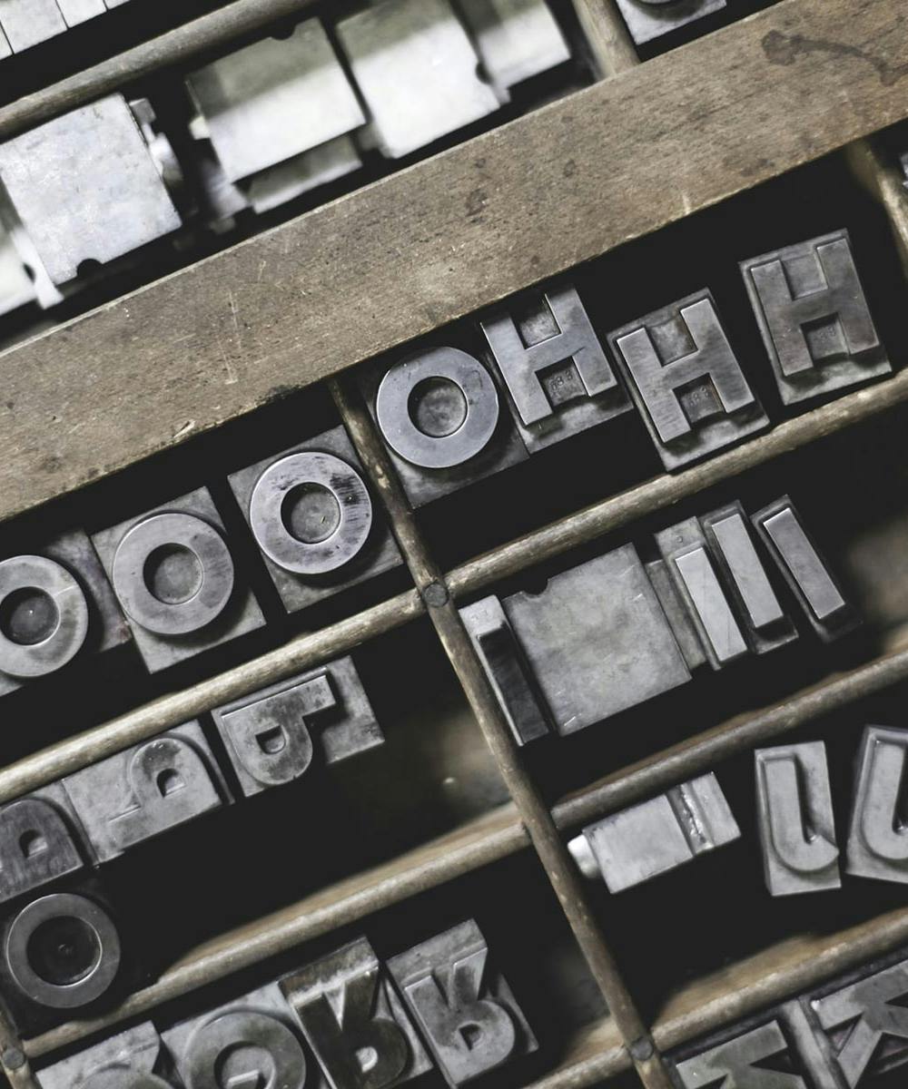
What is typography?
Take any piece of text, a sentence like “There is water on Mars”: it can be typed into a digital document, as we just did, read aloud by a speech synthesizer, painted on a wall or printed on any medium. The sentence never changes, but the way it is delivered always does, whether digital, visual or audio. Still, whenever text is rendered or printed, on screen or on a physical medium, typography comes into play. Erik Spiekermann offers an excellent definition of typography, “Type is visible language”, which we can accept without being too picky about the fact that it refers to type rather than typography. Building on this definition, typography can be described as the craft of arranging text effectively and correctly, following established rules and conventions, so that text becomes visible language. Notice that we never brought up words like art or aesthetics, precisely to avoid any misunderstanding or the idea that you need taste to arrange and organize text. Nothing of the sort: typography is far more functional and practical than you might think.
Why does typography matter?
Once we have established what typography is, we can start asking other questions: who and what it is for, what counts as good typography and, above all, why it matters so much. Keeping its practical function in mind, we can say that typography essentially serves the reader. We mean a real reader, not an ideal one: a reader with a short attention span, little patience and little willingness to be persuaded and drawn in, who is basically looking for any excuse to break free and stop reading. Good typography supports the text, reinforces its meaning and serves the purpose it was written for, so it holds on to the reader's attention.

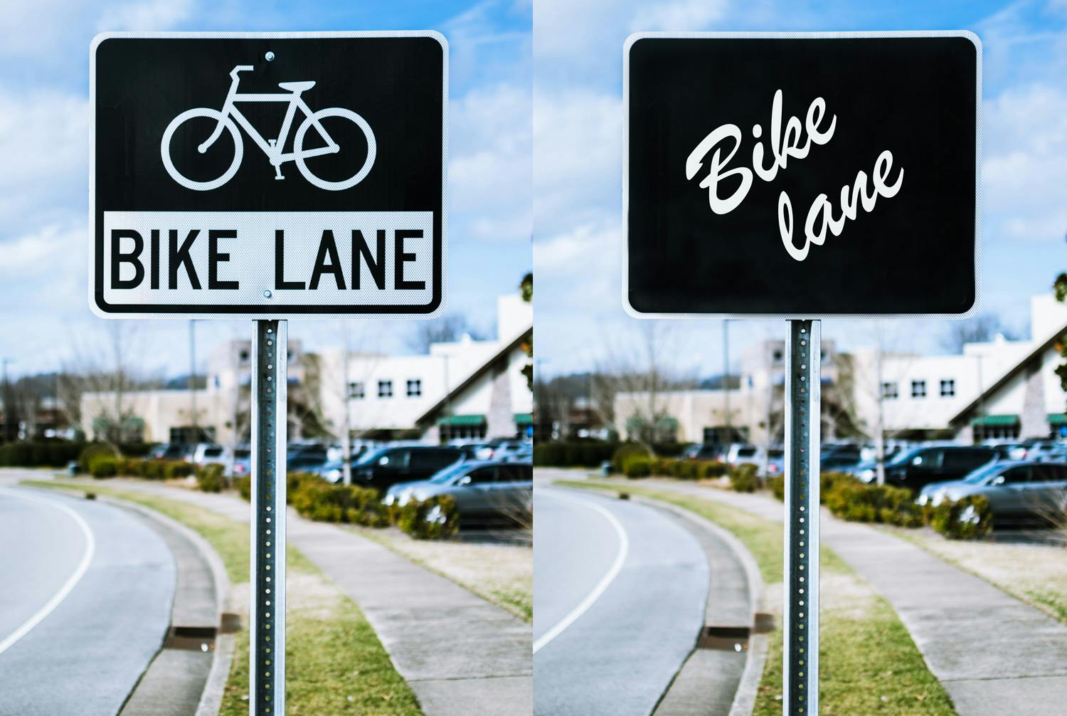
Above is a classic and remarkably effective example of why good typography is tied to the message, to its audience and to its goal.
The text on both signs is identical, but only the one on the left manages to communicate quickly and unambiguously (with the help of a pictogram) that this is a bike lane.
From all this we can easily draw three axioms:
- A typographic choice should be judged by how well it reinforces the message of the text, so the same choice cannot be ideal for every kind of text. In other words, no typographic solution is universal.
- Turning it around, it is risky and presumptuous to claim that only one typographic solution works for a given text: several choices may be equally valid.
- The chances of producing good typography are directly proportional to how well you understand the text: its purpose, who will read it and where it will be displayed. If the text is not understood, the typography will very likely be a disaster.
In a 2003 TED talk, David Carson poses a provocative question to the design world, arguing that a message should not simply be read but communicated, with the line Don’t mistake legibility for communication. We don't intend to dissect the message (fittingly enough) and argue whether this statement holds up; for now it is enough to take it at face value, from both angles: a legible message is not enough if it doesn't communicate something (or the right thing), and an important message delivered in a dull, uninteresting way may well be lost. Carson, then, seems more concerned with how something is communicated than with the substance of the message itself. Just consider that Ray Gun, the magazine where Carson was art director, once ran an entire interview set in Zapf Dingbat (a practically illegible typeface made of signs and symbols) simply because the content was deemed extremely boring.
Type size
It all depends on the medium: for print, the standard body text size is between 10 and 12 points, while for the web a size between 15 and 25 pixels is recommended. The main reason is easy to guess: we look at a screen from farther away than a printed page. Other kinds of text on all sorts of media vary widely in size, but as a general rule you should never print anything below 6-7 points, depending also on the font you use. The suggested convention, such as staying within 10-12pt for printed text, is a good starting point, but nothing stops you from setting body text at 9.5pt or 9pt. In fact, two fonts from different families with identical typographic settings (body size, line spacing, kerning and so on) will often have a different visual weight or, to put it simply, take up a different amount of space.
In practice: text properties
After all that theory, let's move on to some practical advice; after all, we did say that typography is about practicality. To boil it down, any body of text has four fundamental properties worth mastering: type size, which we'll express in points for print and in pixels for digital; line spacing; the width of the text block; and the choice of typeface. As usual, we are always referring to the style of the main copy, or body text, which is the most critical part of any layout, digital or print, for a simple reason: it is also the largest. Every project should first focus on making the body text work, and then style every other element accordingly. In the example below, two typefaces from different families are shown side by side, both sans serif. The one on the right clearly takes up more space than the one on the left.

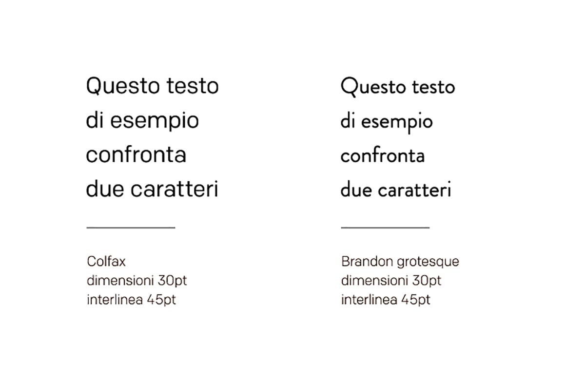
The reason is that a type designer decides up front the shape of each character and the proportions across the font family. We won't dig into technicalities beyond the scope of this article; it's enough to know that one of the fundamental properties of a typeface is called x-height and, as you might guess, it refers to the height of the lowercase x. As the example below shows, two different fonts can have very different proportions.


In this case, and in others that follow, the eye decides what works best: rules and constraints are good to have, but in some respects typography is a fluid matter that often calls for manual adjustments. A thorough article titled Typography is impossible, which shows how arranging text often leads to results that differ from what was intended, offers a lovely line that every typography lover adores: “Text is aligned when it looks aligned, not when it is aligned.”
Line spacing
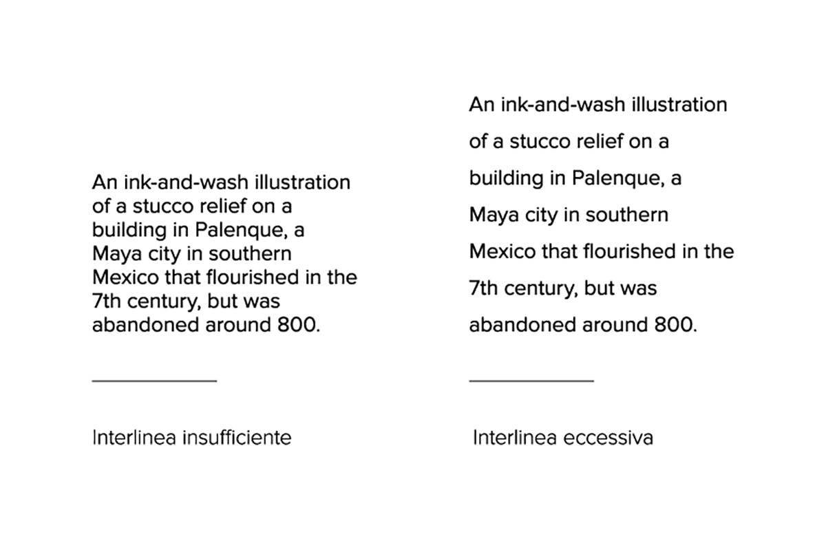
Line spacing, or leading, is the vertical distance between two lines of text. For most texts, the ideal line spacing is between 120% and 150% of the type size. Line spacing closer to 120% tends to suit short paragraphs, while longer paragraphs call for more generous spacing.
Text block width
Also known as line length, it is simply the distance between the left and right edges of a text block. An overly wide text block is tiring for the human eye, which struggles to follow a straight line (it is well established that the eye makes many micro-movements while reading) and then to jump back to exactly the next line. The fix is simple: shorten the line. But by how much? An ideal empirical line width would be hard to pin down given how much typefaces vary, so it is easier to set a range of characters: body text is usually recommended to run between 40 and 80 characters per line, spaces included, to make reading easier.
Typeface
The choice of typeface has an immediate, unmistakable visual impact on everything you write, but it matters no more than good composition and formatting of the text itself. As we said earlier, there is no universal solution in typography and several solutions may work for the same problem; in the same way, we would be hard-pressed to recommend one definitive, universal font. It's probably easier to say what not to do: stay away from free font sites (with the exception of Google Fonts) and always look for a better alternative to the default fonts preinstalled on your operating system. There are many reasons, some less obvious, why a professional font made by a type designer beats a system font: a professional font includes a comprehensive set of glyphs, mainly accented letters, every punctuation mark and ligatures (pairs of letters drawn as a single glyph; common ones are the combinations fi or fl, or the ampersand, which is simply the evolution of the Latin letter pair et), as well as alternate versions of the same letter, and you can rest assured that spacing and letter fitting (or kerning) are correct. Proxima Nova, for example, comes in 7 different weights.

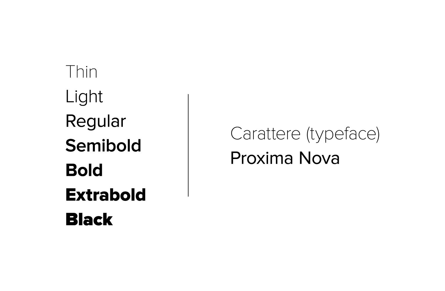
Another advantage of a professional font is that it reliably includes several weights (besides regular, or roman, you'll certainly find other weights such as light and bold) as well as different styles (besides italic, there may be compressed or extended variants). Keep in mind that the bold version of a font is not just the base font with extra thickness applied mechanically, nor is the italic version created by geometrically transforming the characters: they are fonts redrawn specifically for that variant. Think twice before you hit the B or i button in a text editor: you are artificially altering a font designed with a precise purpose and style. In other words, just don't.
Hierarchy and contrast
With the advice so far on setting text blocks, you should be able to produce good documents and avoid the most obvious mistakes. However, when you lay out a document or design a web page, the relationships between texts come into play, so you need to decide on a hierarchy and on how to create contrast that highlights the most important parts. Make the most of having several weights within the same typeface: alternating them helps create rhythm and establish a hierarchy among the different parts. Beyond changing size and typeface, there are other ways to emphasize parts of the text.
- Experiment with color: it works great for web pages, but use it sparingly in print, or not at all. If you really can't resist adding color, pick one and play with its shades.
- Use bold or italic, but never both. Pick one or the other. It's also good practice to avoid italics with sans serif fonts and stick to bold.
- Underline text. It's common and acceptable on the web when the underlined text is a link, but avoid it in print: it's a holdover from old typewriters, which had no other way to emphasize text, and today it makes little sense.
- Use small caps. But be careful: the small caps function in common word processors actually creates a scaled-down version of the capitals, producing fake small caps with characters that are too tall and vertical strokes that are too thin. Small caps should be built into the font itself, as an OpenType feature.
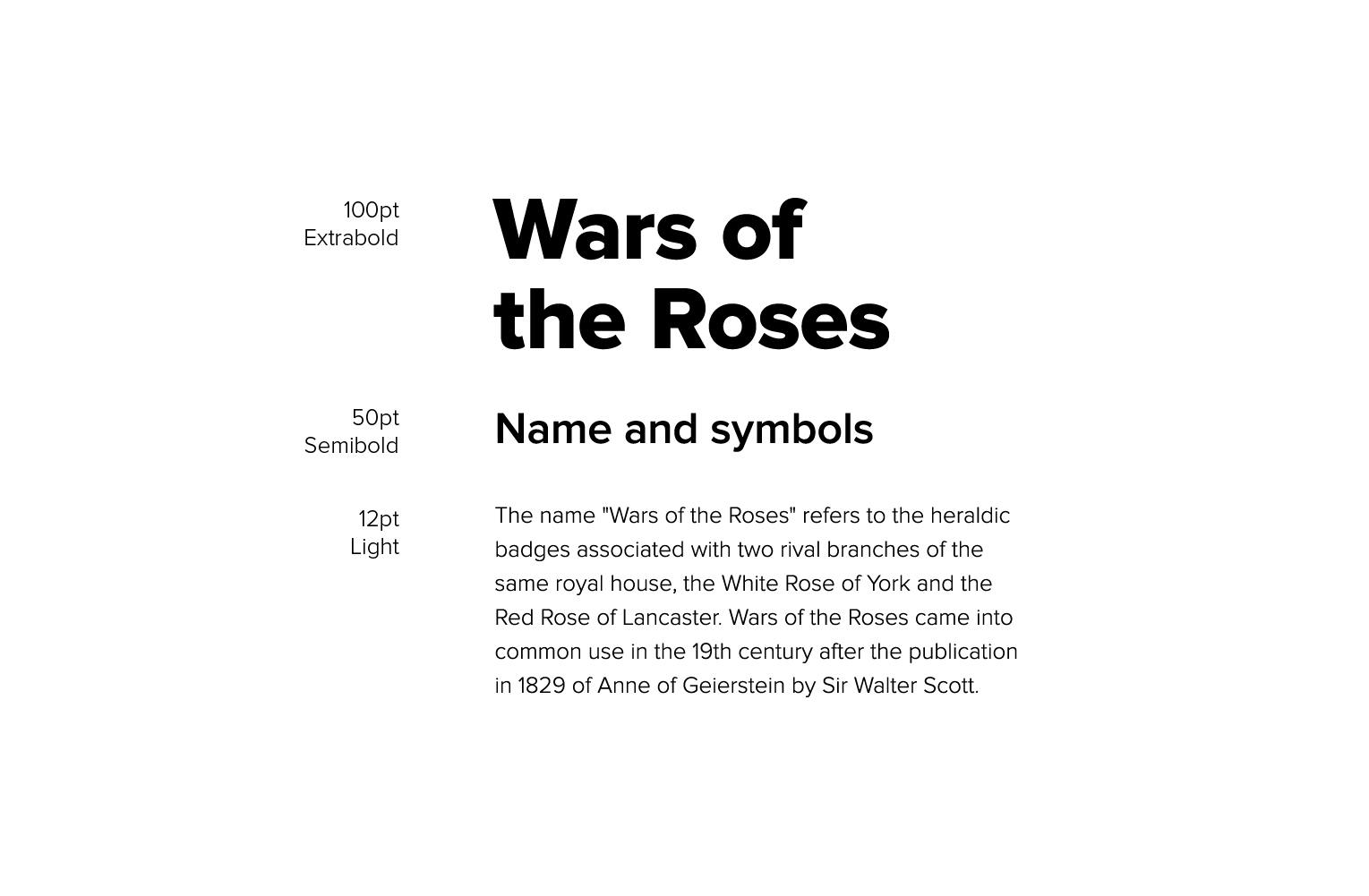
Below is an example of a title, subtitle and body. Three different weights are used and the sizes are proportional, each one half the size of the one before.
Conclusions
This is just the tip of the iceberg when it comes to typography. We didn't cover important topics such as punctuation, and others were only touched on briefly. Here are some links for further reading.Typography is impossible — An article showing how text never behaves the way you'd expect.The punctuation guide — A guide to punctuation.Practical typography — An extremely thorough and authoritative book covering everything about typography.Fonts in use — An archive of images and resources showing typefaces in use.Style Manual — A useful resource on punctuation and common writing mistakes.Just my type — A collection of font pairings in use.Fontstand — Try out and rent professional fonts.


