

How We Designed the Boboli Gardens Maps (and Why It's Only the Beginning)
Cantiere Creativo's relationship with the Uffizi Galleries began three years ago, with the complex and rewarding work we are carrying out on the museum complex's websites. During a workshop with the team, we found ourselves considering a series of printed maps to complement our work on the web properties.We were curious to see whether we could translate our experience in digital UX and usability into an entirely physical context, combining stylistic and graphic care with clear legibility.



Goals
The Boboli Gardens map project was made possible by the experience and expertise of theUffizi Galleries Administration, which gave Cantiere Creativo all the information needed for the preliminary work and stayed by our side through every later phase, making sure the work followed their guidelines and the results met visitors' expectations. It was the Administration that explained the need to improve the visitor experience, starting with a map that could offer clear, engaging answers to two ongoing challenges in representing space effectively. The first challenge was to effectively represent the garden's unusual terrain, giving a realistic sense of its many slopes so that every guest could choose the route best suited to their physical needs. Many visitors underestimate the distances involved and end up cutting their walks short, especially on sunny days, when they face climbs they weren't expecting. The second challenge was to make the visit more enjoyable by offering clear, well-defined routes, designed for every type of visitor, including people with limited mobility, who needed a route without significant slopes. Of course, the map also had to follow user experience best practices and provide all the useful information about spaces, services, must-see points of interest and current temporary exhibitions. That was a considerable amount of information to make visually consistent and easy to read in a printed brochure, handed out at every museum ticket office after purchase.
First steps
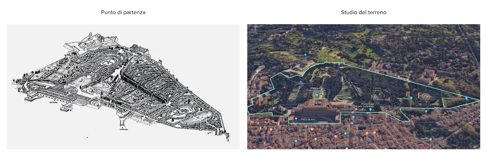
We started from Google Maps satellite imagery and historical maps of the garden to get familiar with the specific features of the site, followed by on-site visits and field tests to truly make the spaces our own. Only then did we draw and refine the first map, accurately reconstructing the garden's morphology, elevation changes, main roads and paths, green areas and points of interest.

Slopes at a glance
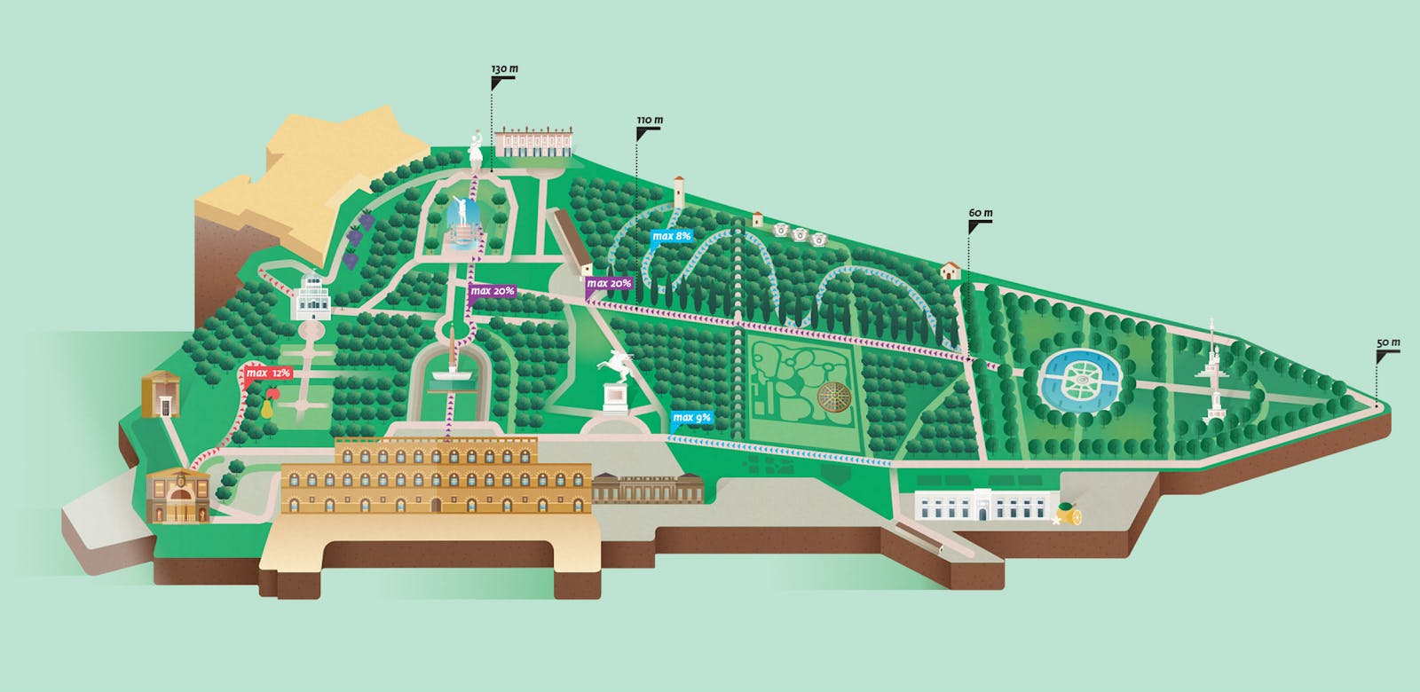
Conveying a clear sense of the slopes inside the Boboli Gardens was truly our biggest challenge. To solve it, we designed a map that shows the elevation of each area at a glance, ranging from a minimum of 50 meters up to 130 meters. This way, visitors get a realistic overview of the spacesright from the start, and can choose where to go based on their abilities and preferences.

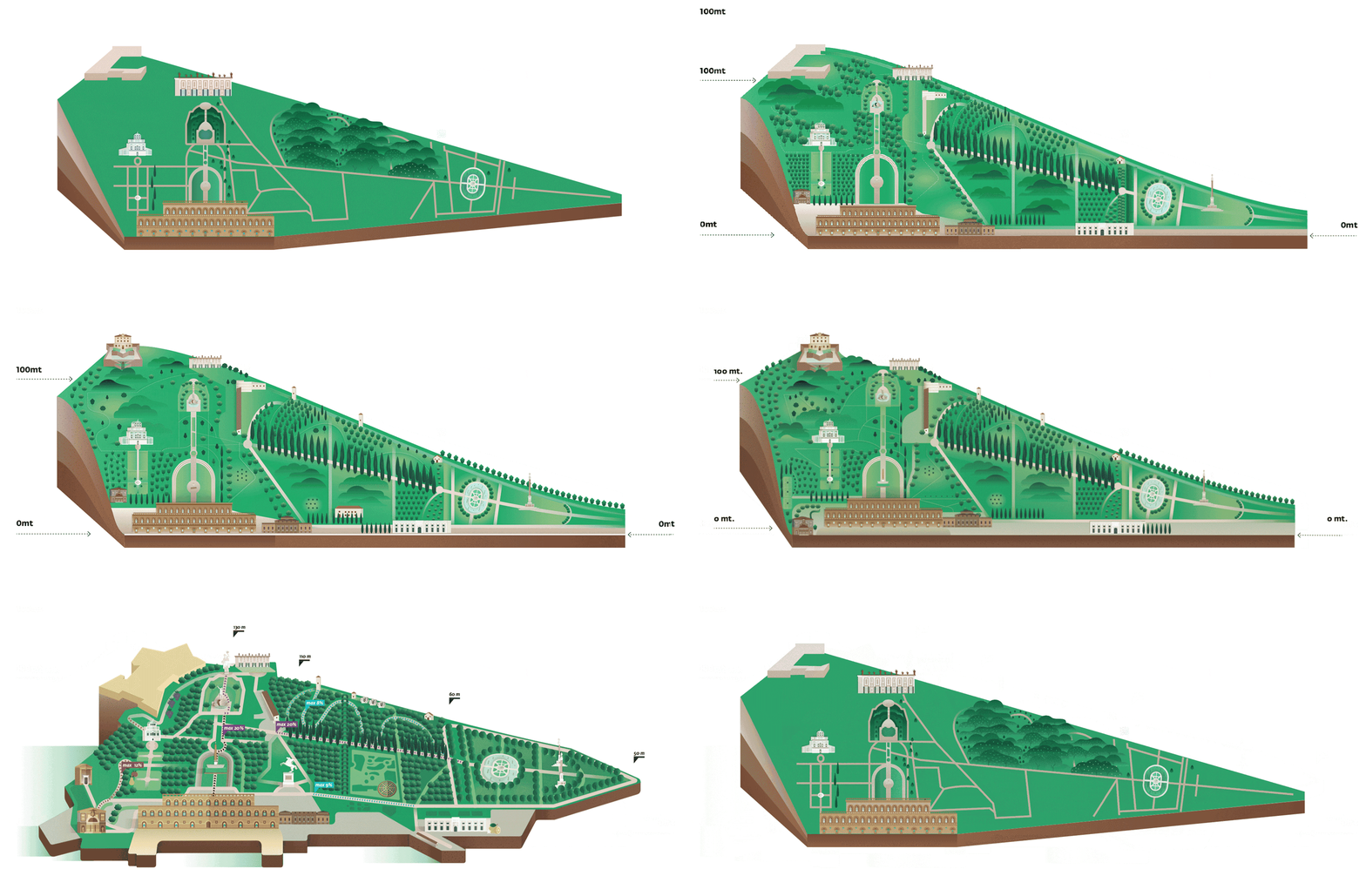
Drawing this first map turned out to be a difficult process, full of trial and error. The complexity lay in having to show, at the same time, the slope rising from Palazzo Pitti up to the Palazzina dei Cavalieri on the left, and the one running from the Vasca dell'Isola to the Vasca del Nettuno, from right to left. The GIF below shows part of this long design process:

A map made for exploring
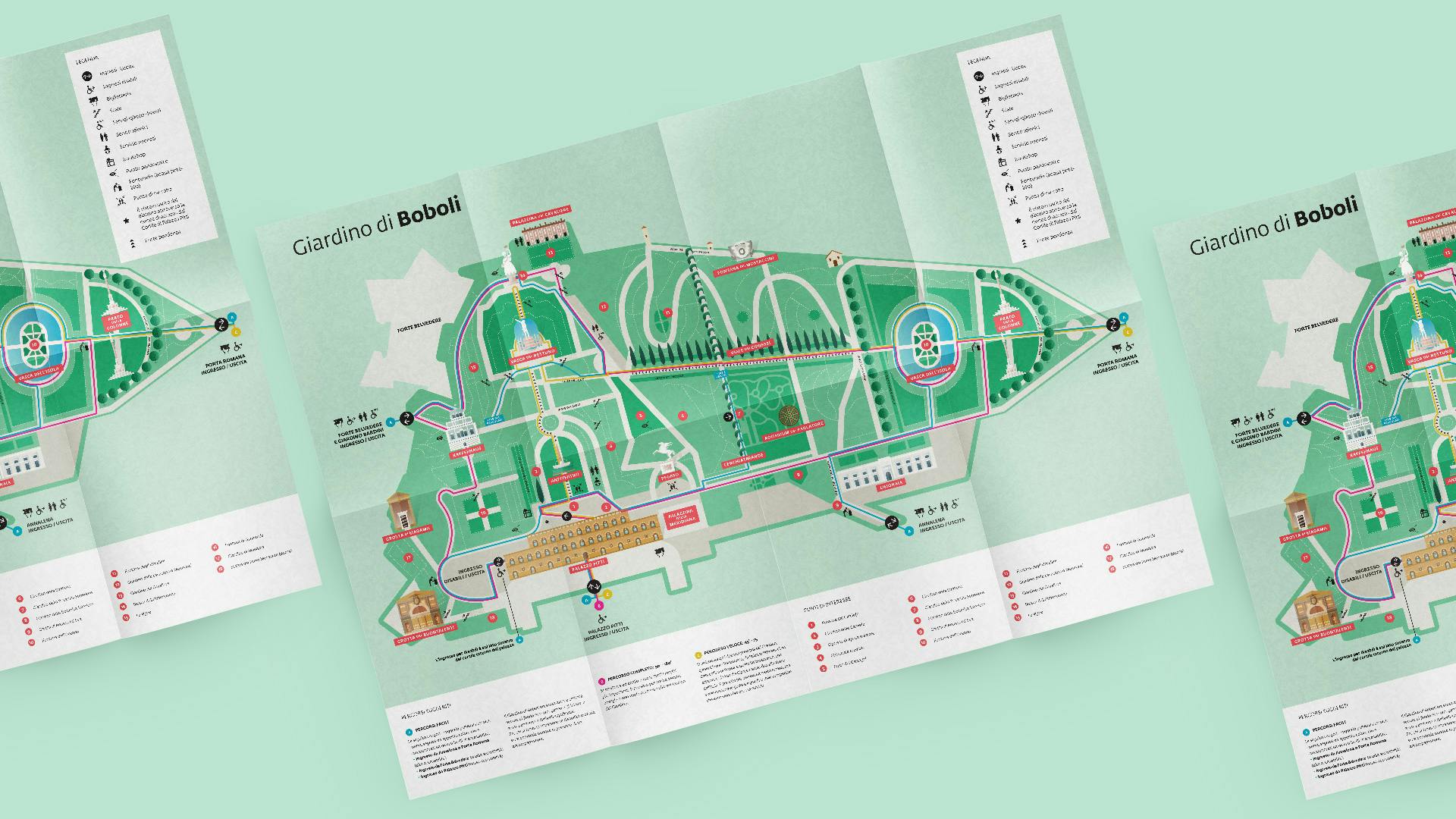
The main map sits inside the brochure: a two-dimensional top-down view of the entire garden, to which we added simplified vector illustrations of the most important architectural monuments and artworks. The goal was to create simple graphics that visitors could use instantly. The map suggests three types of routes: full (in pink), quick (in yellow), and easy (in blue). The last one is designed mainly for people with limited mobility. The map also marks the steepest elevation changes with black lines made of triangles, while facilities and services are shown with a custom icon set. The garden's four entrances and the points of interest are marked with numbered red dots, while temporary exhibitions are shown with numbered white dots. Main roads are displayed as thick light linesthat immediately catch the eye, while paths are marked in dark green with a thinner dashed line.

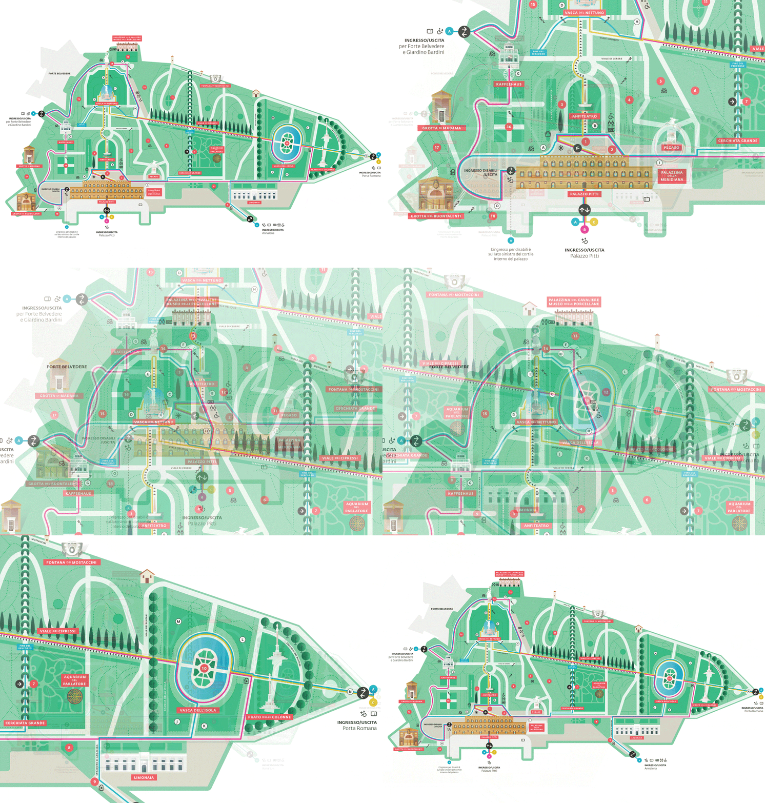

This map also required in-depth study to find the best way to show its routes without cluttering it. Our first approach was to create a map dedicated solely to this purpose. It was a simplified version of the flat map that highlighted only the three routes; for its look, we took inspiration from classic subway maps.

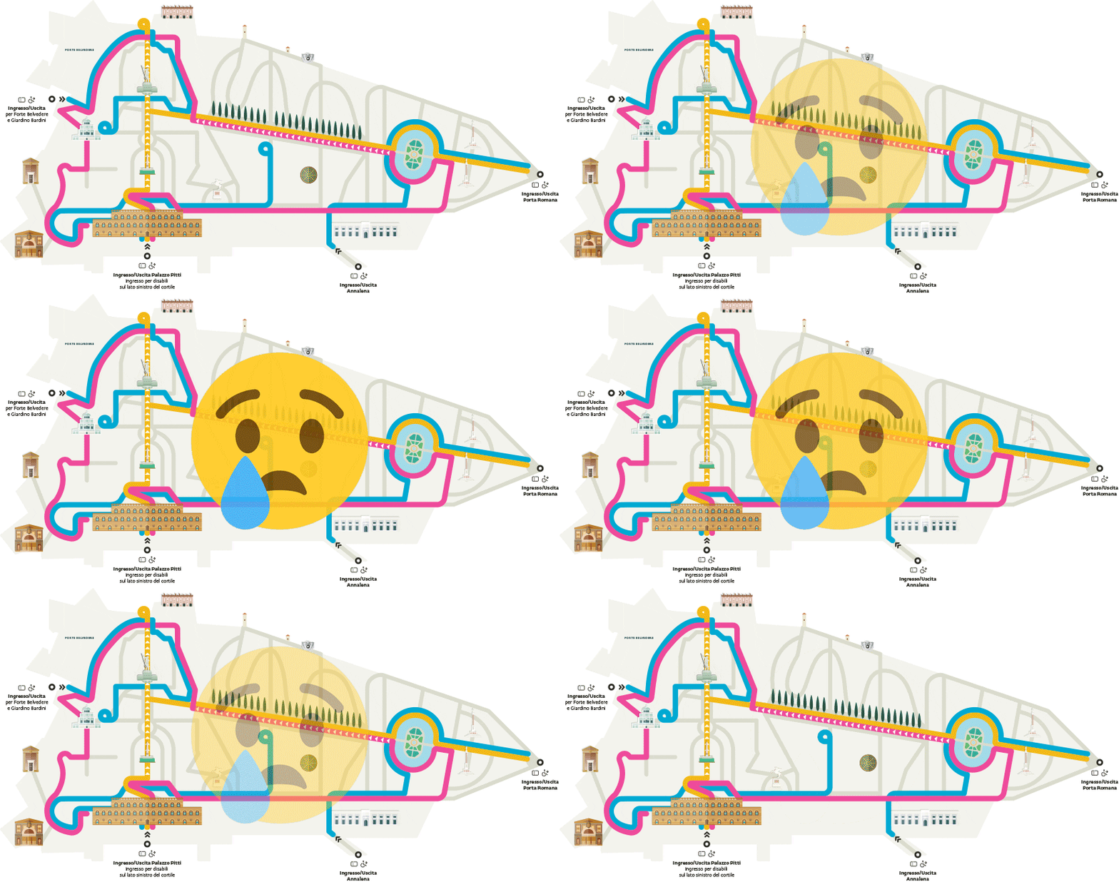
We really liked the result, but how could we fit it into a brochure that already had two maps? Having to juggle three different maps was becoming genuinely inconvenient for visitors. In the end, we managed to integrate the routes into the flat map, giving people all the key information in one place.
An illustration for every monument
Before starting work on the monuments, we asked ourselves: how do we keep them recognizable without sacrificing the map's legibility? The main goal was to give visitors an idea of what to see inside the garden, without compromising the legibility and flow of the map. That's why we decided not to use photographs, keeping the map lighter and easier to read, and instead created a vector illustration for each major monument, much like an icon. We carried out an in-depth study of shape and color, starting from real images and working by subtraction until we reached the final result.



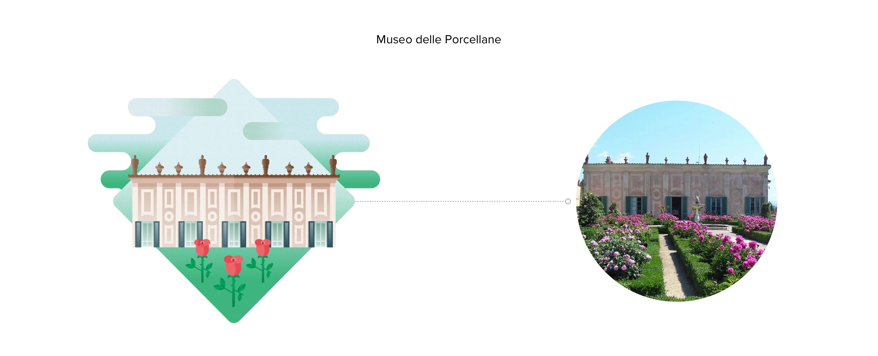


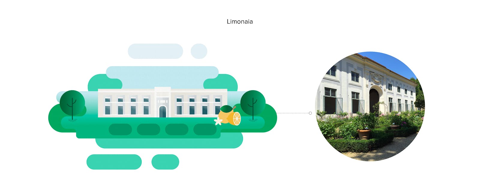

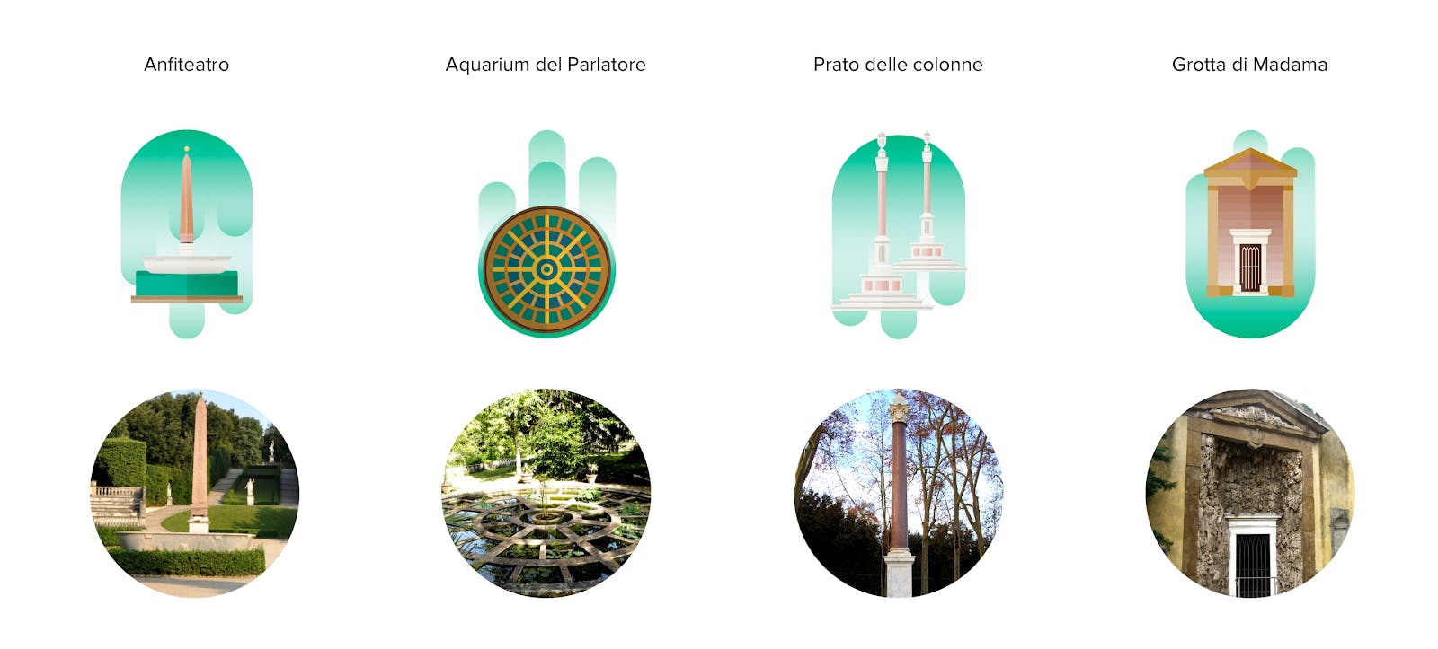
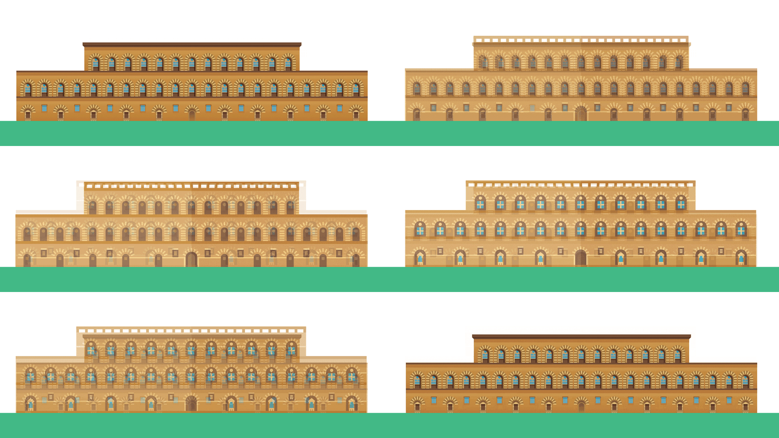
Our first illustrations, while beautiful and elegant, didn't work once printed: too much detail made the map hard to read. We had to go through a process of simplification, highlighting the essential features of each monument without losing sight of its character. You can see an example of this process in our work on Palazzo Pitti:

Clear, readable rules
As a large public space covering an area of about 45,000 m², the garden asks visitors to follow a few rules so that everything stays as perfect as they found it.
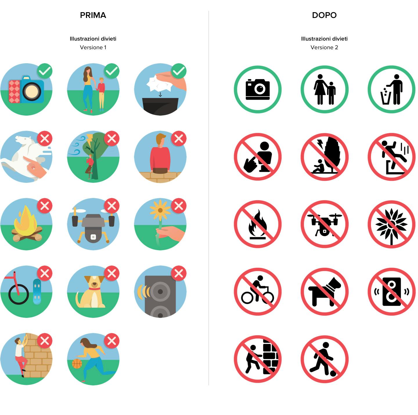
Our first idea was to turn the rules into a visually engaging, playful experience, so that respecting shared spaces would feel like a pleasure rather than an obligation. We loved the final design visually, but we realized that too light a touch could have the opposite of the intended effect, which was to communicate the rules effectively and get people to follow them.
Another issue, perhaps the main one, is that the Gardens welcome hundreds of people from different countries and cultures; a universal visual language mattered more than a fun or engaging design. So we designed clear, simple symbols that anyone can read, whatever their nationality or cultural background.

The final result
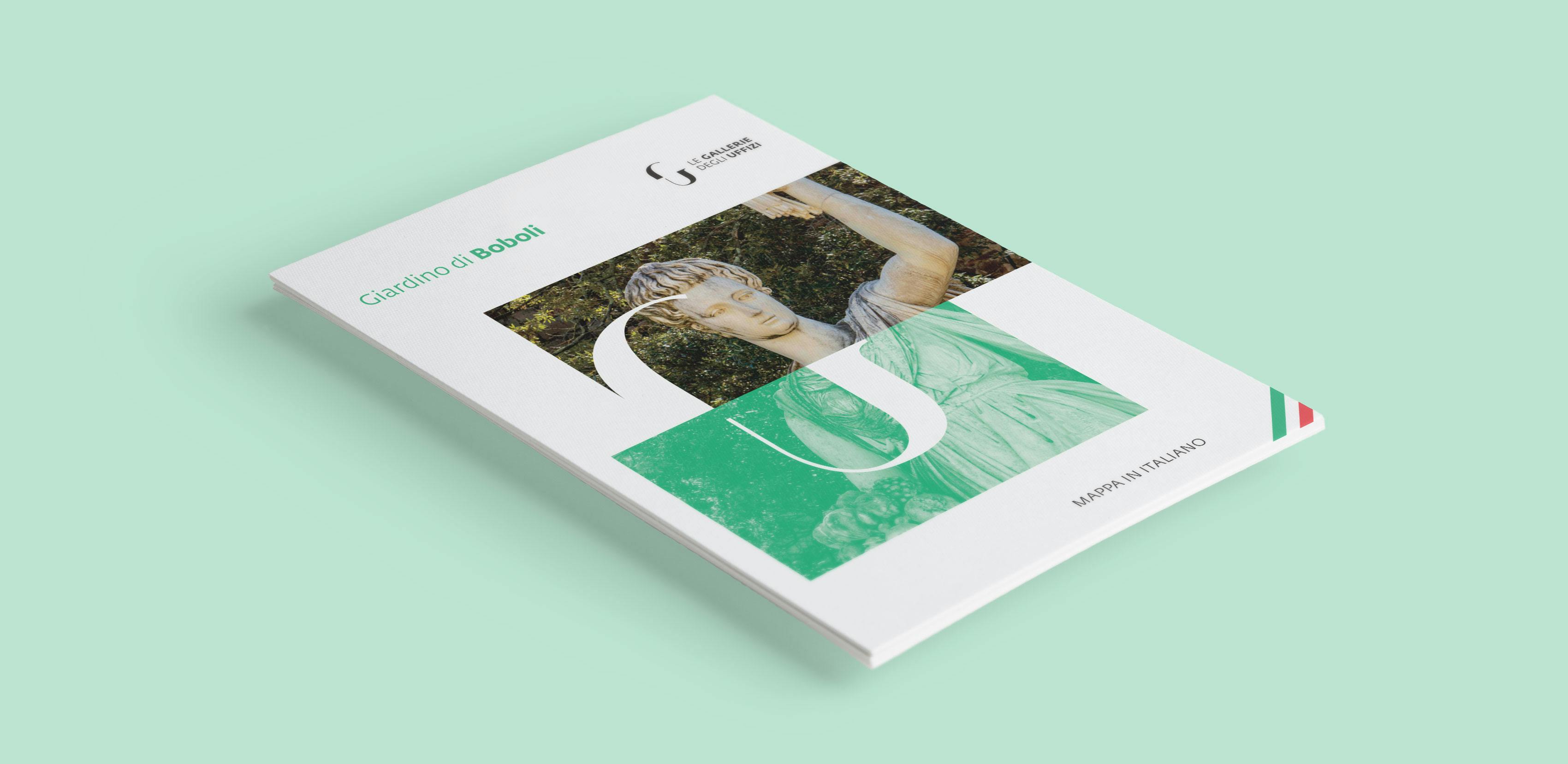
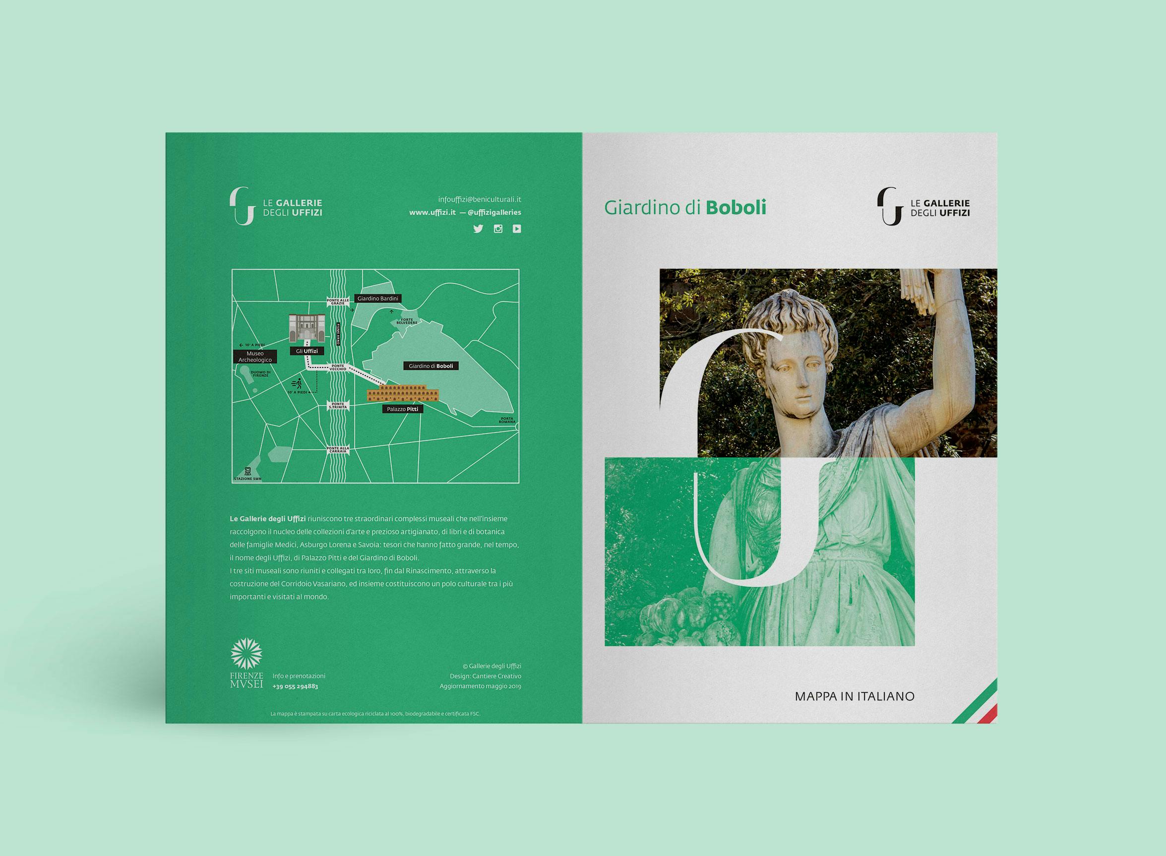
The brochure contains all the information about the Gardens: an introduction to their history, opening hours and ticket prices, and all the rules visitors need to follow. It also includes an additional map showing where the Gardens sit in relation to the rest of Florence's historic center, and explaining how to reach the other museums that make up the Uffizi Galleries complex.



How is the map made?
Size: Unfolded, the map is A2; it is then cross-folded twice into a closed A5 format. Paper: All the maps are printed on 100% recycled paper. This choice was proposed from the very start of the project and backed collectively by the whole Uffizi team, especially Director Schmidt. Although he knew the costs would be higher than average, the director was aware of the environmental impact and chose to help reduce the product's environmental footprint as much as possible.
Next steps
Alongside the Boboli maps, we are preparing maps for Palazzo Pitti and the Uffizi Galleries. It's a completely different challenge because it takes place inside a palace: there are no roads but corridors, no green spaces but rooms, and instead of architectural monuments we have to do justice to Renaissance masterpieces. The routes designed for the Uffizi aim to give every visitor, depending on how much time they have, an incredible, fully immersive experience of one of the most flourishing periods in art history. Our work on the Boboli maps has also given us ideas for expanding what the Gardens offer. Our study of its spaces and unique terrain could translate remarkably well into a smart signageproject, a true wayfinding system that reinforces the map work by giving visitors in situ directions on where to go, walking times between points of interest and slopes, along with a full set of signs graphically consistent with the maps. Alongside the physical work, it would be a great opportunity to enrich the digital experience with an interactive map. It would be a fully explorable virtual space, giving visitors up-to-date information on whatever device they choose. The information architecture would run through DatoCMS, so all the content would be centralized. This would let every experience update at the same time, from the app to potential VR experiences, with a single click. The same would apply to print: imagine temporary exhibitions that, once updated in an app, would also sync to the print file for the paper version.
Acknowledgments
The support of the entire Uffizi Galleries team was essential throughout every phase of the project, particularly architect Antonio Godoli, along with Bianca Maria Landi, Angela Pintore, Maria Spanò and Andrea Biotti, who guided us toward the ideal solutions for the Gardens' specific use case and were always available to clear up any doubts. We also owe special thanks to Director Eike Schmidt for the trust placed in us by entrusting us with this important project.


