Oriente Occidente branding
Oriente Occidente is a cultural association that believes in the practice and culture of dialogue, building networks of relationships through the language of dance, which by definition transcends borders: of language, ethnicity, gender, age and culture. With a visionary outlook and a commitment to excellence, it is a bridge between East and West, North and South, form and content, ethics and aesthetics, past and future.
Oriente Occidente is a cultural association that believes in the practice and culture of dialogue, building networks of relationships through the language of dance, which by definition transcends borders: of language, ethnicity, gender, age and culture. With a visionary outlook and a commitment to excellence, it is a bridge between East and West, North and South, form and content, ethics and aesthetics, past and future.


The brief
We were asked to redesign the Oriente Occidente brand. They had a historic logo, created in 1981 by Italian designer “Duilio Martinis”, which they were very attached to and didn’t want to overhaul, but they also knew their overall branding had some gaps. There was no consistent style tying all their communication together, and they also needed a brand book setting out guidelines for a unified vision of their visual world, along with a clear message to communicate all their projects to the world.
Cantiere Creativo was asked to create a brand identity reflecting Oriente Occidente’s vibrant vision and capturing its spirit and outlook.
We started from their own words: “We want to help build a freer, more welcoming society, open to differences, through artistic practices centered on the universal language of bodies.” From there, we developed a dynamic, forward-looking and contemporary visual language, with an openness and accessibility true to Oriente Occidente’s deep roots.
It’s the first time the brand has taken a holistic approach to its identity, visually bringing together its programs, events and festival so they are more recognizable as part of the same institution.
The solution
The Cantiere Creativo team worked closely with Oriente Occidente’s leadership to develop a strategy that included restyling the logo and creating a new visual system that fully represented their identity and conveyed their soul to the world: a welcoming, inclusive organization committed to giving everyone access to the arts and to every kind of performance. Oriente Occidente needed a visually flexible identity that would help it open up to different cultural contexts and foster a sense of connection and sharing within institutions, its audience, the city and beyond.
With a strong focus on accessibility, our first proposal was to darken their red key color to make it easier for everyone to read. The change is very subtle, but enough to be clearly perceived by most people, making it inclusive and welcoming.
Changing the color was far from enough: together with the client, we decided the logo needed to be improved as a whole.
Logo construction
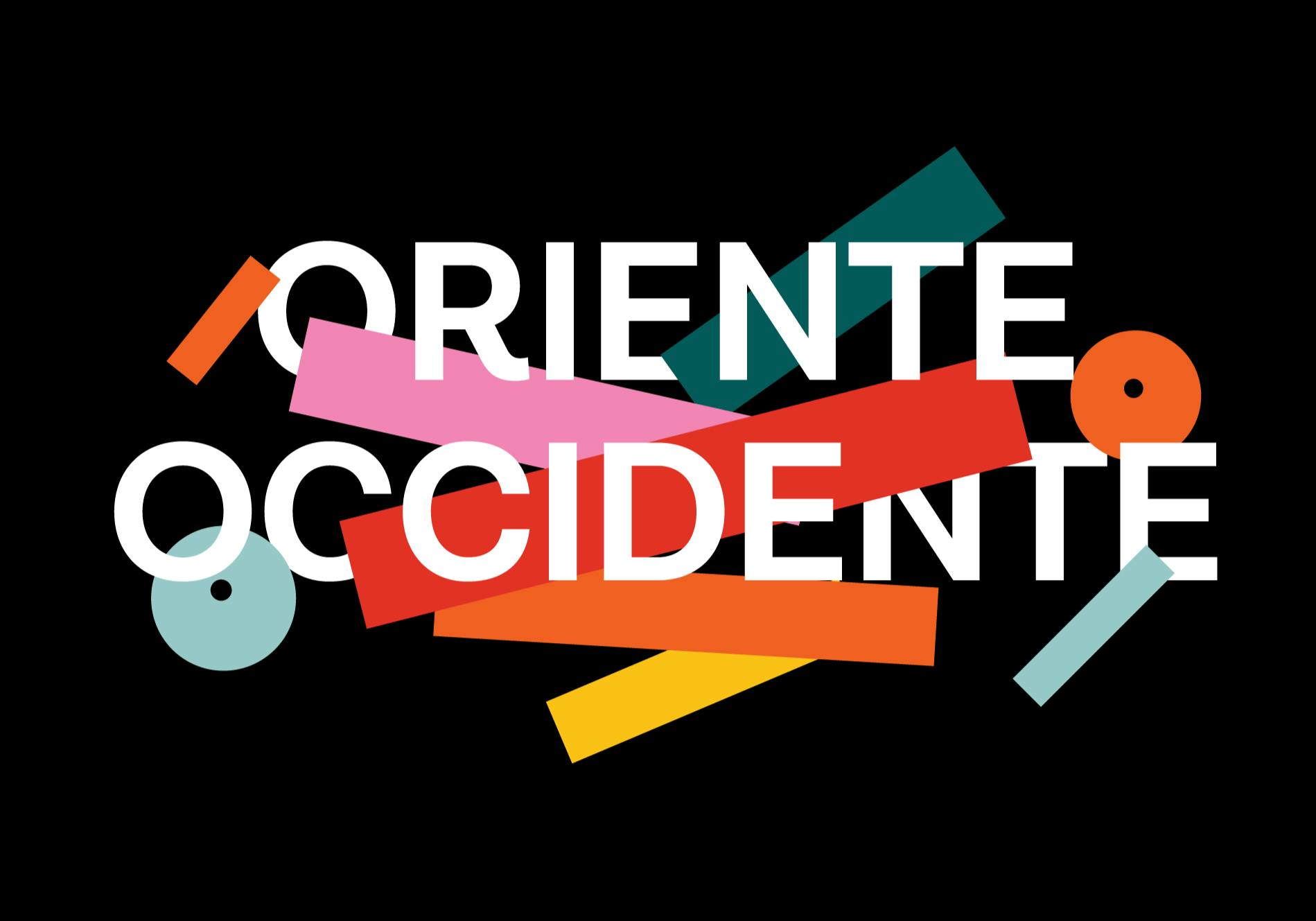
Our starting point was the historic “O” icon: the mark had to stay intact, because it represented not only a piece of history but also, in communication terms, a sign that has remained unchanged since its creation in 1981. So we mainly worked on restructuring the whole, studying the choice of typeface and revising spacing and hierarchy.
The wordmark is set in Lota Grotesque Alt 1, created in 2017 by designer Daniel Hernández, Latinotype: a friendly, accessible geometric sans serif with elegant, minimalist shapes and an original design in certain characters. The R, for example, has a distinctive detail in its descending leg, conveying a sense of movement in the word Oriente.


New identity
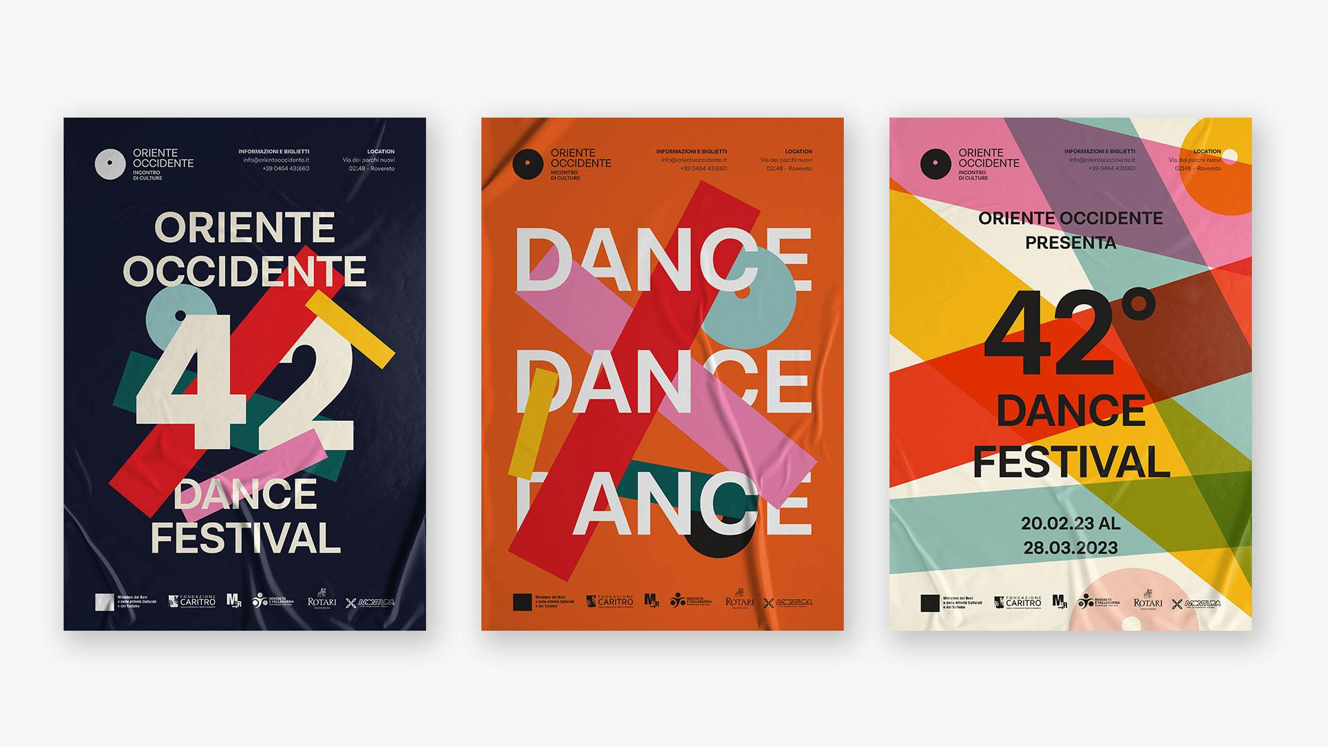
The new identity has the range and flexibility to feel at home with every kind of performing art: it can be exuberant and creatively playful, or smart, serious and institutional when needed. The geometric shapes derived from simplifying the logo are the unifying symbol across all brand platforms and expressions, from posters and show materials to animated digital ads and social media. The shapes can be reconfigured to perform within the layout and interact with photography, or become image containers. The identity can also act as a framing structure for the graphics of individual shows.

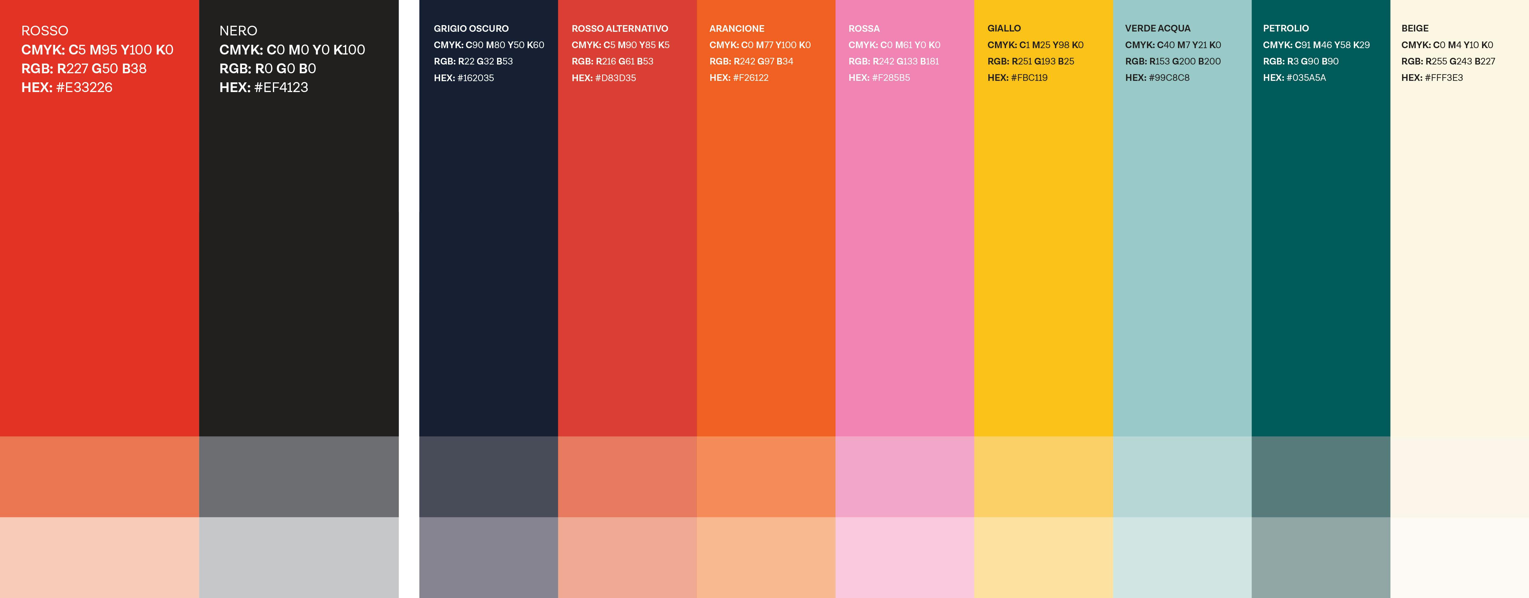
Color is a key element of Oriente Occidente’s new identity. The design team created a vibrant color palette that radiates positivity and evokes the energy and movement of dance. The visual language features a set of interconnected geometric shapes with overlapping colors: these are used throughout the identity and tie together every aspect of the organization’s communication.
The new identity is designed to work seamlessly across online and offline applications, including the website, social media, printed materials, facade signage and digital advertising. The team also created tools for Oriente Occidente’s staff to roll out the identity with their own local agencies.