A model collaboration for a new public administration website
On February 4, the new institutional website of the Dipartimento per la trasformazione digitale della Presidenza del Consiglio dei ministri went live, and here at Cantiere Creativo we're proud of it both as citizens and as professionals.


As Italian citizens, it's great to see that the collaboration between Designers Italia and the communications team of the Dipartimento per la trasformazione digitale is not only continuing but moving full speed ahead with its goal of designing and building websites that serve as a benchmark and a milestone for Italian public administrations in terms of both design and content design. There is clearly a clear, well-defined vision of the digital future of public administrations, and the road traveled so far proves it. As professionals, our satisfaction comes from having taken part in the final phase of the project, supporting the team in the important work of implementing the redesign and contributing our experience in information architecture and content modeling with headless CMSs, as well as in static site development. Our past collaborations with the public administration have been among the most interesting in our ten-year history, like the software released as open source and written in Ruby that we built a few years ago for the Team per la Trasformazione Digitale, so our expectations were sky-high from day one!
Choosing the CMS
The previous website was managed entirely from a repository, so there was a real need for a CMS that would make updating and writing content simpler and smoother. The team carefully studied every available CMS option, weighed the pros and cons, and ultimately decided to go with a headless platform to ensure maximum flexibility, ease of modeling and omnichannel delivery. The platform they finally chose was DatoCMS: not only because it's one of the most complete headless CMSs in the world, but also because it's 100% Italian.

Since DatoCMS was born inside Cantiere Creativo (and we use it for all our projects, from simple editorial websites to sophisticated multi-tenant architectures), our collaboration felt natural from the very start.
Project goals
The material the redesign team gave us was already very clear, with precise wireframes, structures and navigation flows, plus the many resources provided by Designers Italia, such as the front-end development kit Bootstrap Italia.

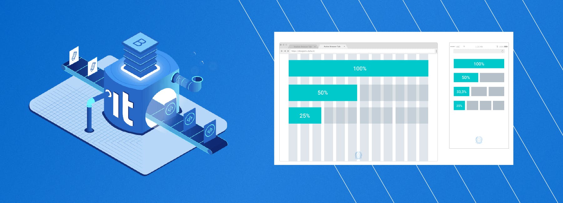
At Cantiere Creativo, we started work with clear ideas and enough material to proceed with complete confidence. The first goal, from an information architecture standpoint, was to translate the redesign team's extensive, excellent work into the CMS by configuring it correctly, implementing the models and customizing its interface. The second goal was to develop a front end fully compliant with Bootstrap Italia, highly accessible and written in clean, maintainable code. All while making sure to deliver complete work, mature and ready, leaving the redesign team all the documentation and know-how they needed to iterate on and improve the project without us.
100% Bootstrap Italia (and maybe more)
As requested, development was based on the Bootstrap Italia theme, and we faithfully used all of its components to reproduce the mockups with the utmost precision we had been given. During the work, some needs emerged that required us to extend and customize the theme with custom components. So part of the work focused on making sure no component conflicted with another and that the project stayed true to the original specifications. All the components we created are not only compatible with Bootstrap Italia but can also be reused in future public administration projects with few or no changes. The final result you see on the live site is one of the most faithful implementations of Bootstrap Italia ever published, with a few customizations that significantly improve the browsing experience and the interface without betraying its philosophy.
Finding the right generator
In the preparatory phase, we analyzed, evaluated and presented to the redesign team the static site generators we felt had the best features for the project. The aspects we considered most important during the analysis were:
- flexibility;
- ease of system configuration;
- the ability to preview the result quickly.
Our first proposal was Fermo, for its speed when frequently publishing large volumes of content, its integration with the DatoCMS GraphQL API and its live preview feature. After discussing it, we settled on Middleman as the best choice: despite lower performance and a few missing features, it has an open source community that is definitely more mature. The sections were built by writing HTML and CSS with Slim and SCSS respectively.
Clean, maintainable code
All the Ruby code we wrote strictly followed the formatting rules and conventions of the Lint standard, specifically RuboCop Lint. Although it should be the norm for projects of any size, unfortunately it's still an often underrated practice. Not this time: the code was brought into compliance before every commit, ensuring it's as clean as possible and easy to manage, maintain and understand for whoever continues the development.

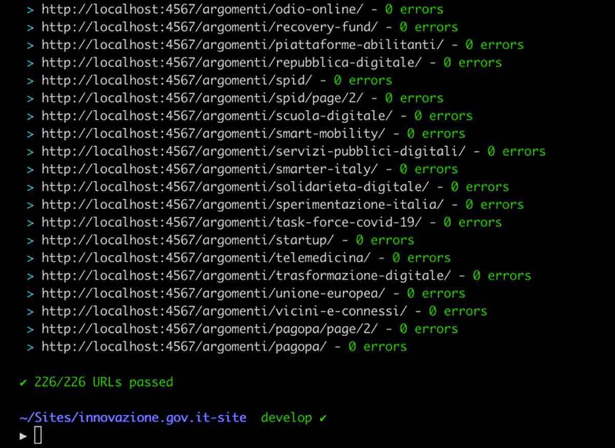
Today, the code has no errors or warnings, improving efficiency and maintainability, even for teams outside Cantiere Creativo. Besides allowing us to deliver a trouble-free product, it helped us noticeably optimize and improve performance, as we'll see later on.
The headless revolution
The article on the Designers Italia blog already explains quite clearly why a headless CMS solution was chosen:
To best meet all the needs that emerged during the design phase, the software choice leaned toward a headless CMS solution, that is, a system that doesn't include the content presentation layer but only a back-end component for creating content. A technology that, through APIs (application programming interface), makes it possible to fully decouple content from the interface through which it is shown to users, and to distribute it across multiple platforms from a single CMS. In addition to the features mentioned above, the chosen system also offers complete editorial flexibility in content creation, thanks to a customizable set of modular blocks that enables full control of workflows, ease of use (and reuse), along with extensive collaborative editing capabilities. The ability to model the CMS down to the smallest detail also makes it effective from an SEO perspective. A solution that is still uncommon in public administrations but that, looking ahead and especially from a multichannel perspective, makes the editorial team's work more effective and efficient.
For the team, the chosen CMS was a small revolution in how they worked at every level. Just think of the difference compared to some monolithic systems, where you create a single model for articles and only vary the attributes, with all the complications and difficulties that entails. Thanks to the change in technology, the team was instead able to create ten different models with only the fields they needed, thanks to modular blocks. First of all, Cantiere Creativo helped the redesign team with information architecture, so that all the identified content types translated smoothly to the platform. We then moved on to the implementation of the actual models in DatoCMS, first preparing the environment and then creating all the blocks needed for the content types that had been defined.The CMS views were optimized to give editors a consistent, easy-to-understand interface; the optimizations covered menus, hints and field groupings. To let editors create content with peace of mind, we defined their roles and permissions and then built a validation system for individual fields: now no article can be published without passing all the necessary validations, as precise and granular as required.
Custom search and lots of small details
Working with teams like the one redesigning the Department's website is always a pleasure, because you stay involved both in the big picture and in the details. For example, working on the search feature was a great team challenge, because we understood how important it was for the Department's website to make all its information easy to find, offering clear exploration by topic as well. That's why we developed a widget built ad hoc for live searches of any type of content, based on the indexing done by the CMS.
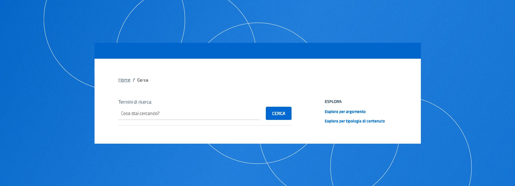
The search feature was also modified to make it accessible, including the semantics of the results, while staying within the limits of Bootstrap Italia. We also worked from the content modeling stage onward to make searching by topic convenient: that's why all content types have attributes such as category, which helps search without limiting it to the article type. At the same time, content is divided by area of responsibility between the Minister for Technological Innovation and Digital Transition and the Department, two entities that deserved to be handled separately. The redesign team paid attention to every detail and allowed us to focus on things like handling the many documents that could be downloaded from the previous site. Besides being numerous, the documents were already linked from the websites of many institutions, and we couldn't risk a manual import with possible addressing errors. That's why, together with the Department's technical staff, we built import scripts and redirects that saved the addresses of the old documents and pointed them to the files uploaded to the new site.
Why accessibility matters
For us, accessibility is a cause close to our hearts, and one we're finally able to focus on consistently in our new projects. This approach helped us a lot, because public administration websites must provide an accessibility statement that meets fairly strict minimum requirements. The Bootstrap Italia theme was designed to provide much of the accessibility work needed for the statement out of the box, but we knew we could do more. That's why at every iteration we also tested the site with screen readers and specialized accessibility analysis tools such as Arc Toolkit, Axe and Wave, finding out where to step in to improve it. For example, we made sure that every page always had a descending heading hierarchy (H1, H2, H3, etc.): for some models it was simple, for others we had to get creative to ensure both fidelity to the original design and accessibility. We then made sure all links are paired with a label that gives clear, understandable context about the destination content. To speed things up, every link pointing outside the site automatically gets a label explaining that the address is external. We added skip links to every page: two links reachable with keyboard shortcuts that lead to the body text and the footer and are the first two elements in the HTML. This spares screen readers from going through every header element each time they start reading a page. The testing, checking and editing work was long and painstaking, but it led to the results you'll see below.
100/100
The collaboration between Cantiere Creativo and the redesign team led to literally perfect results on the main metrics Google uses to evaluate a website.
At launch, the site scored 100 out of 100 in Performance, Accessibility, Best Practices and SEO on Lighthouse (fireworks included!). According to the data collected, the First Contentful Paint of the Dipartimento per la trasformazione digitale website is 35% faster than the average of sites based on older versions of Bootstrap Italia, while maintaining excellent accessibility.
What does the future hold?
As far as the Dipartimento per la trasformazione digitale project is concerned, Cantiere Creativo has completed its collaboration, making sure to leave the talented digital teams everything they need to grow the project and improve it over time. All the code is released on the official GitHub repo, along with the documentation (now on the wiki), with an overview of the implementation choices for both Middleman and the styles. We also wrote internal material explaining in detail some specific CMS features for both editors and developers, after providing support and hands-on guidance in the early stages of creating new sections and content types. This is pretty much every web developer's dream: working with top-notch professionals, handing over a finished product you're proud of, knowing that in their hands it can only get better.